As I described here, Shoppermo is the main player of the Recommence service. It is a B2C app that helps users find nearby deals, try them on with the AI virtual try-on feature and find the way to the store. Shoppermo’s vision is to be the street shopping assistant and companion within the product discovery process. Shoppermo had 4 iterations over time, and 2 of them were implemented and tested with limited users. The last iteration was published publicly on the App Store.
Due to confidentiality, I could not share detailed information in this document publicly.
Overview
During the 4 iterations of Shoppermo, I learned many things that led to an MVP, enabling us to publish the app on the App Store. I will briefly describe each iteration, then discuss the last one in more detail.
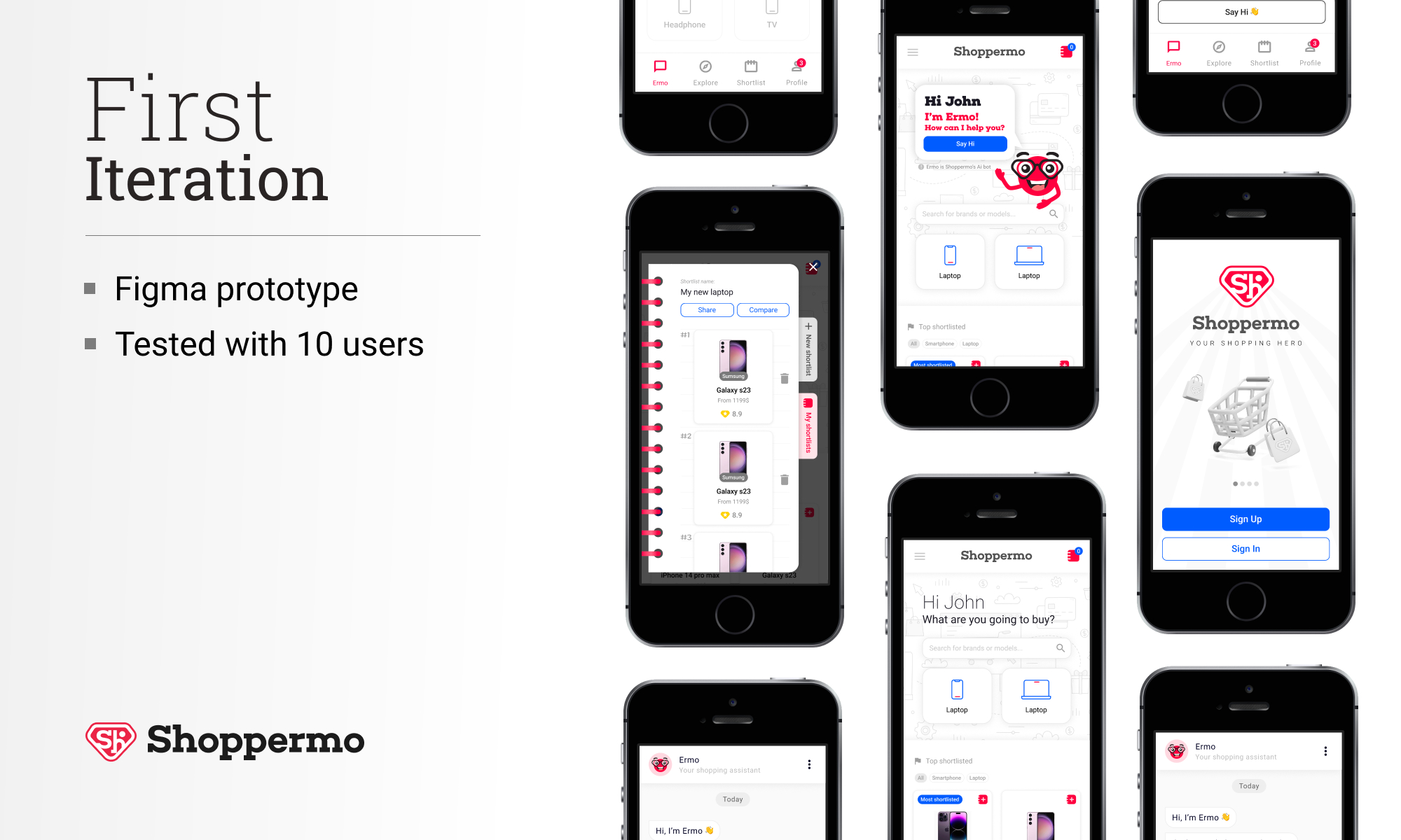
First iteration: It was based on our previous app (ChiChera), which I designed in 2017. The focus was only on electronic devices, starting with smartphones and laptops. Our main advantage was the use of an in-house-built chatbot, which could guide users to find the best choice for them.
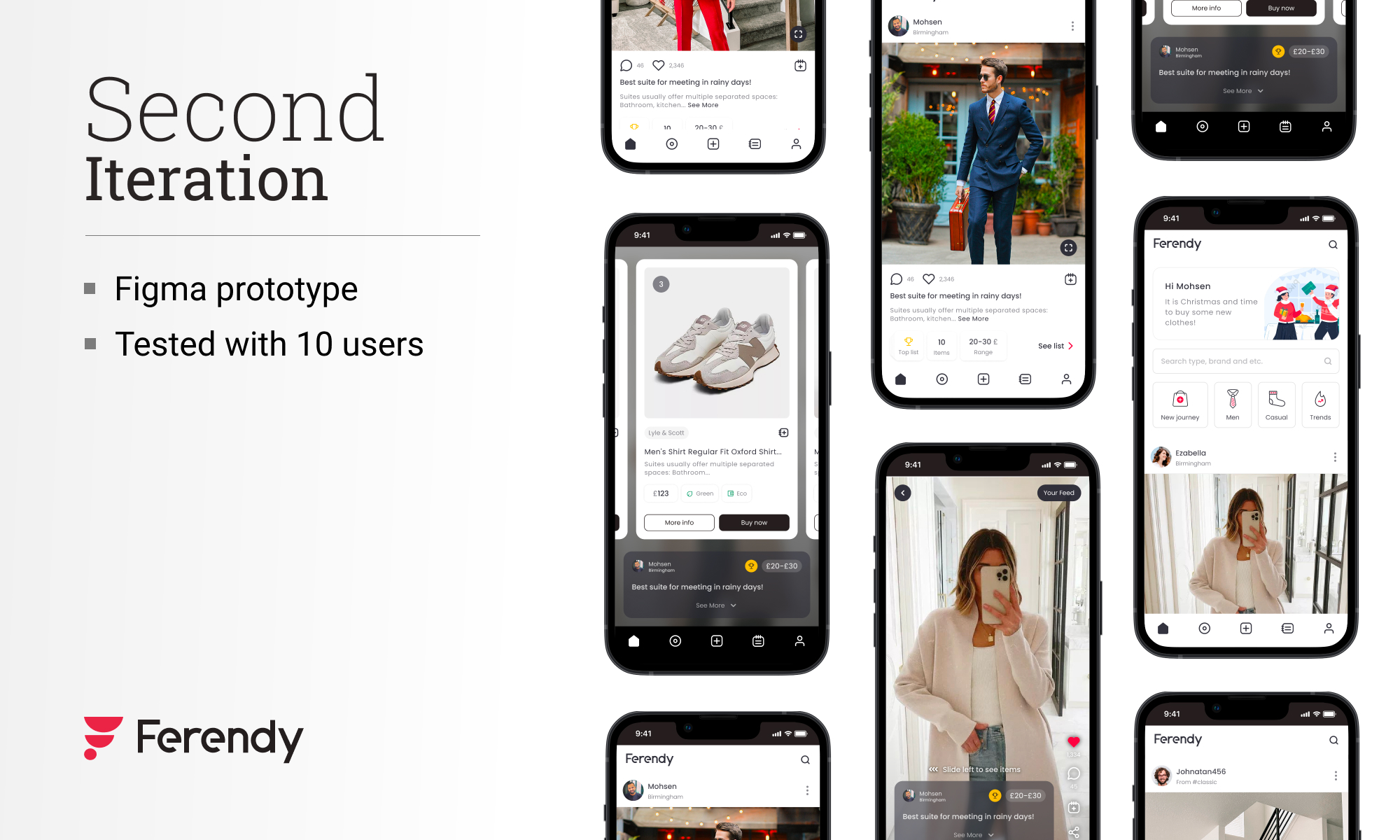
Second iteration: The fundamental of this iteration was based on videos and photos. Each video or photo shows products that the user can buy from online sellers or e-commerce platforms. These collections were based on trends and users' interests.
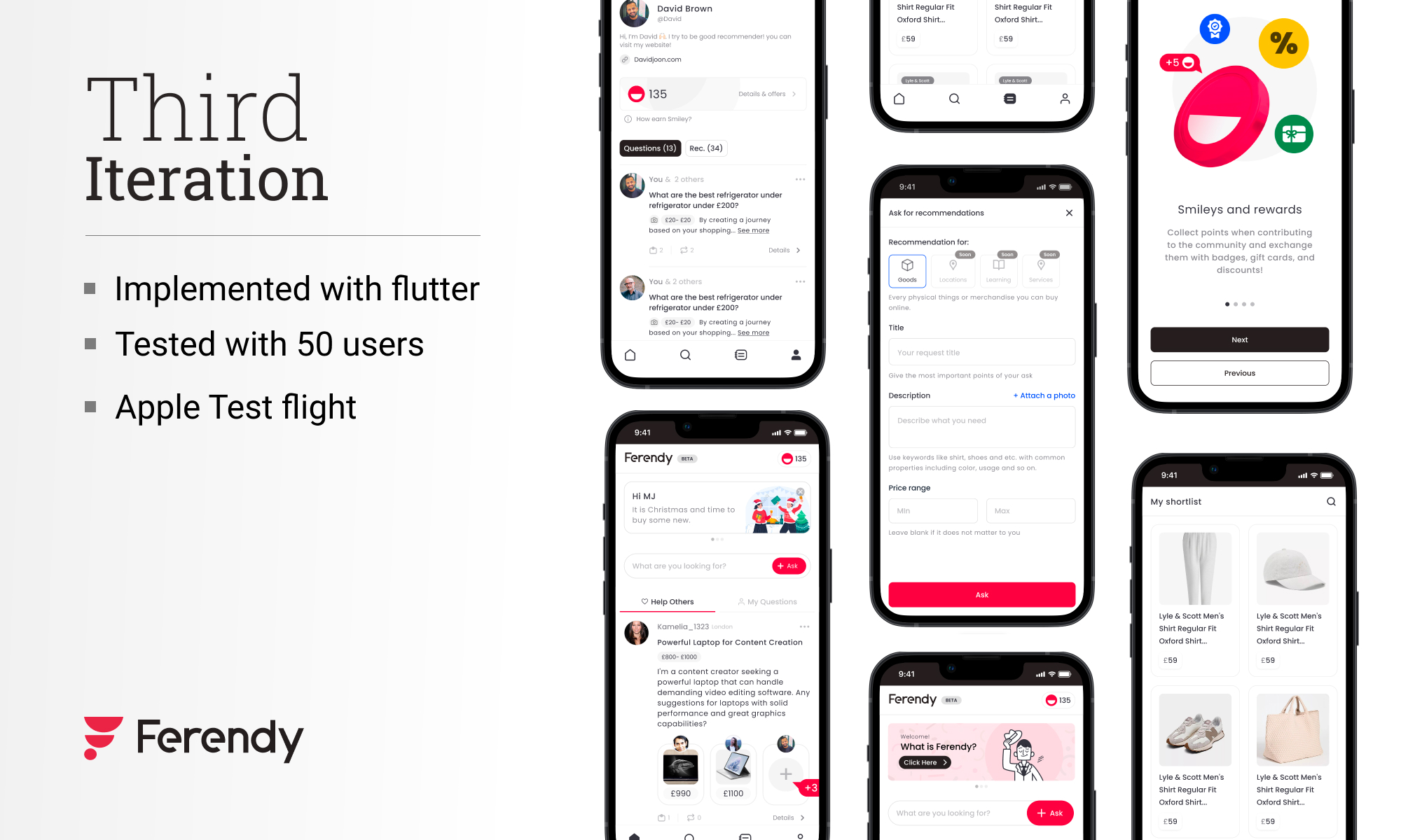
Third iteration: This iteration was the implementation of social commerce, but empowered with AI and AI agents. In this iteration, both online and local businesses were involved in flows and journeys. AI and machine learning were the most important players in this version.
I will describe the fourth iteration in detail in the next sections.
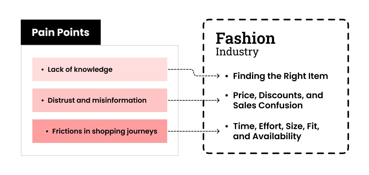
Problem
As I described here and based on our research, the main problems that could map to the general issues in product discovery are shown in the figure below. I tried to address all of them, considering our roadmap and the business's stages, and evaluating costs and resources.
Challenges
In the iterations, four areas posed challenges that defined our limitations and constrained decision-making power. I tried to overcome them by using my previous experiences and learning new things.
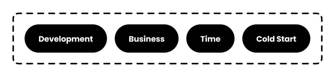
Development
It is vital to consider feasibility and technical implementation constraints, particularly for start-ups; start-ups need high speed and agility. So I had to keep this in my mind to follow these rules. For example, video streaming is very difficult to implement on the back end. More practical example: in prioritising the feature, even small things. I had to keep all features aligned with the business goal and proportionate to the stage we were in.
Business
As a start-up, I have to design everything with these two crucial features in mind. First, they had to be very flexible to fit easily in the cycle; Second, they had to be scalable for the next stages. For example, the ‘Magic studio’ feature had to accept new inputs as a generator and also be scalable for other services in the cycle, like the store’s dashboard.
Time
We can not separate speed and start-ups. The design process must be as fast as possible without compromising minimum standards and qualities. I had to keep the design process compact to earn the power to do better and run more iterations.
Cold start
All cycles have this challenge. How should they start? chicken and egg problem. So, in designing the cycle, one of the most important things was solving the cold-start challenge. This situation was very tricky, because I had to keep the system scalable and aligned with the final goal.
Solution
It is clear that to ensure the cycle's functionality, we need to consider both shoppers and sellers. Here, I will just talk about the user(shopper) side, which is the Shoppermo app. As I mentioned, given the challenges and situation of our startup, we needed something that would go viral and convince users easily, but also be strong and scalable. We gained many insights from our previous iterations, and our focus was on fashion and street shopping.
Based on what I’ve described above and here, I designed the main sections as follows:
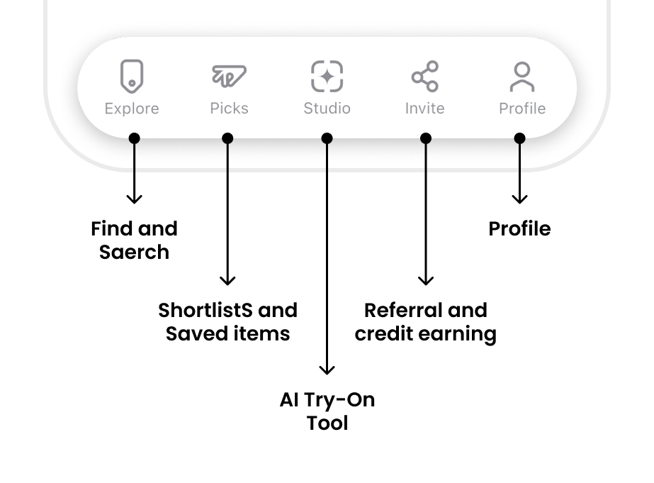
Explore
In the app bar, you can see the credit amount and notifications. Credits are used to generate try-on photos and to access our AI features. Users can get more credits by buying a subscription. Although we give 50 credits every week for free.
The content of the page is based on a user’s location. Also, users can select different streets and locations based on their preferences. They can search for products and deals; the search system uses semantic search, allowing users to find the products they are looking for more easily.
Categories are a dynamic section which changes based on the user behaviour over time. They help users find the starting point of their shopping journey easily.
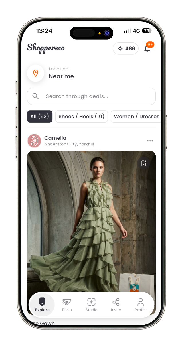
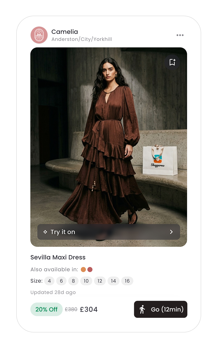
A deal card has 4 main sections. The store’s information: users can see the store page by tapping on the store’s profile picture.
The product image section has two important actions. First, the save button, and second, the ‘Try it on’ button, which leads to the studio tab and lets users see the product on themselves.
The product information section shows the name and the related attributes. This section changes based on the product’s type. For example, this section for clothes shows available colours and sizes, but for accessories shows the material used.
The action section shows the sale mode, like percentage of, seasonal sales, etc. The ‘Go’ button shows the walking time to the store. It opens the navigation app.
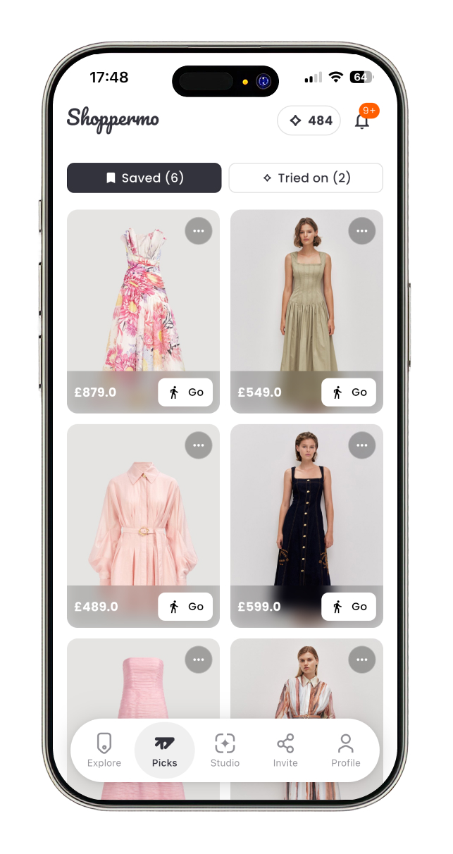
Picks
A deal card has 4 main sections. The store’s information: users can see the store page by tapping on the store’s profile picture.
The product image section has two important actions. First, the save button, and second, the ‘Try it on’ button, which leads to the studio tab and lets users see the product on themselves.
The product information section shows the name and the related attributes. This section changes based on the product’s type. For example, this section for clothes shows available colours and sizes, but for accessories shows the material used.
The action section shows the sale mode, like percentage of, seasonal sales, etc. The ‘Go’ button shows the walking time to the store. It opens the navigation app.
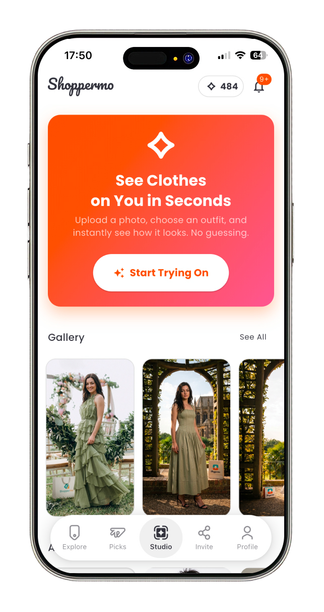
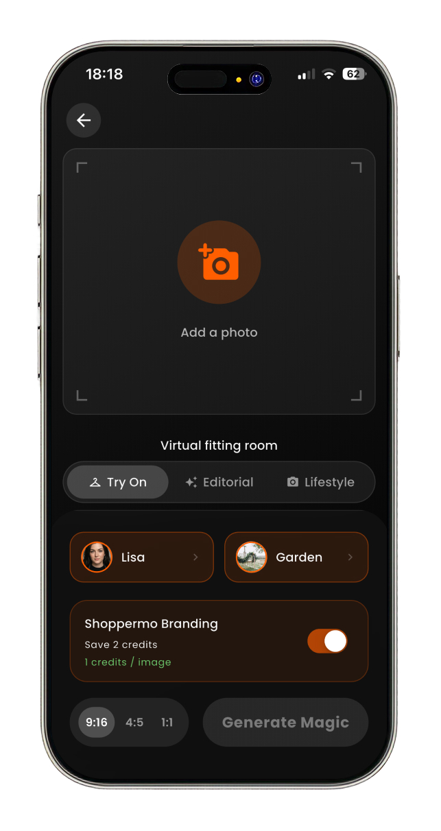
Studio
In the studio tab, users can create a magic! They can see clothes that they like on themselves in different modes and styles. In this tab, there are 4 sections.
Studio entrance CTA and container with dynamic content that changes based on the user’s behaviour. For example, if they saved some clothes that they have not tried on, the contents of the box encourage them to try them on.
The gallery section shows the photo that they have created.
Users can create their own avatars and spaces. Avatar creation has simple steps, users give their details like height, weight, body type and some selfies, and Shoppermo generates their avatar. Also, there is this possibility for users to create their own space by uploading only a photo of the place they like.
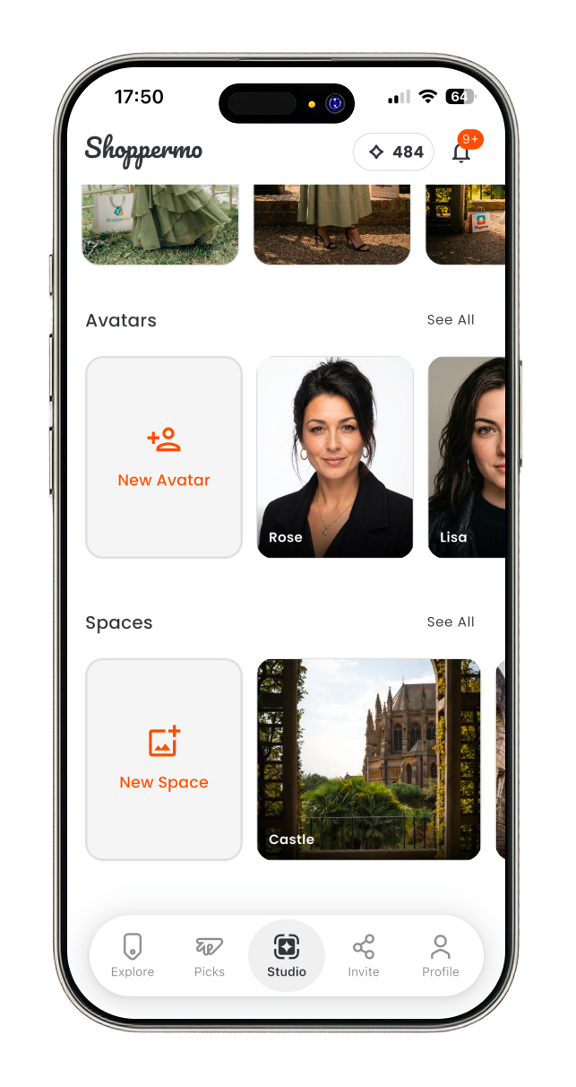
In the studio page, there are 5 sections.
Share and Profile
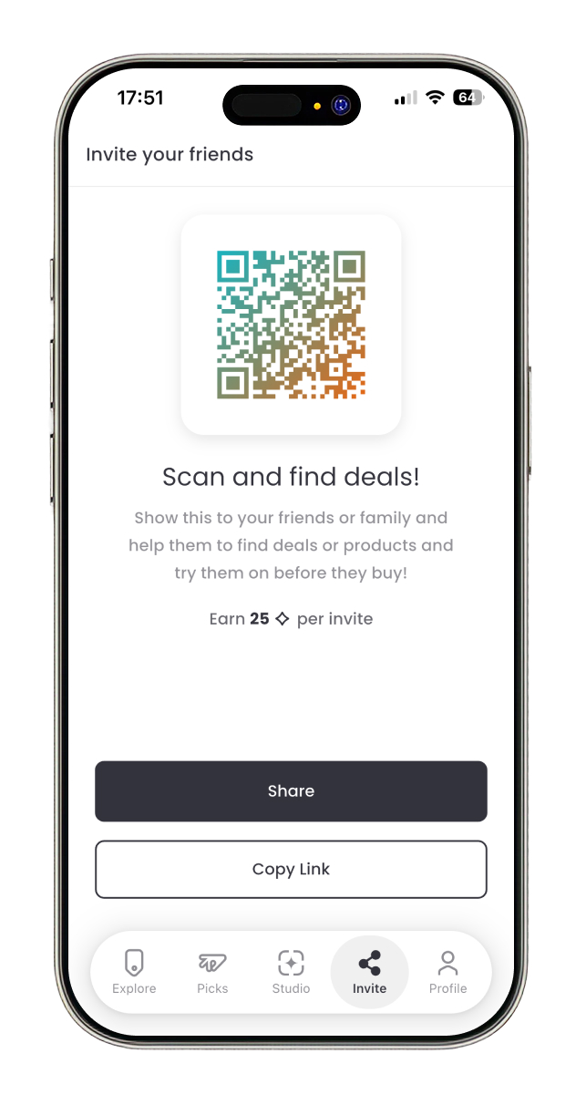
The share tab changed a lot during the design process, finaly based on what was possible, we decided to dedicate this tab to encouraging users to invite their friends and earn credit. Users can send the invitation link or ask their friends or relatives to scan the QR code.
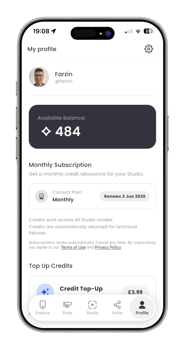
The profile page had the same story during development. In the current version, it shows subscription status and plans, top-up packages and transaction history.
Development
During the development of the iterations, I learned Dart and Flutter in about 1 month and implemented the 3rd iteration in about 2 months. After that, I implemented the final iteration over about 3 months, including the iOS and Android apps, the dashboard, and the websites. I used Claude for better performance and debugging in the 4th iteration. Follow is the summary of the implementation process.
Outcome & Reflection
Shoppermo reached the App Store as a fully implemented MVP after four major product iterations. The final version brought together location-based product discovery, AI-powered virtual try-on, credits and subscriptions, in-app purchases, authentication, sharing flows, and a custom design system.
My role covered both product design and front-end development. This gave me the opportunity to connect product strategy, user experience, technical feasibility, and implementation speed into a single continuous process. I was responsible not only for designing the user journeys, interface patterns, and product flows, but also for implementing the mobile app and supporting product infrastructure with Flutter.
As an early-stage startup, the project required constant prioritisation. Many decisions had to balance user value, business goals, technical complexity, and the speed needed to reach the market. Instead of designing an ideal product in isolation, I focused on building a practical, scalable MVP that could be launched, tested, and iterated on.
After the public launch, unexpected operational circumstances shifted the startup's direction. As a result, the product did not continue into the next planned growth phase. However, the project's outcome was still significant: we transformed an ambitious concept into a real, published product and validated the core product direction through design, implementation, and launch.
For me, Shoppermo became a valuable example of end-to-end product ownership. It strengthened my ability to design under uncertainty, make fast but structured product decisions, work within startup constraints, and turn complex AI-driven ideas into usable mobile experiences. Most importantly, it showed me how closely product design and engineering need to work together when building a startup product from zero to launch.
Led the product design and front-end development of Shoppermo from concept to App Store launch.
Turned an early-stage startup idea into a real MVP
Delivered an end-to-end product under startup constraints