Azki is the leading insurtech company in Iran, with more than 8 million users and over 8k insurance policies sold daily. Azki has another venture, including Azki Sarmaye, Azki Seller, Azki Vam, and Azki Service. The design system had to support all the ventures I mentioned and scale with them or for new ones. The name of this design system was Lighthouse.
Business Context
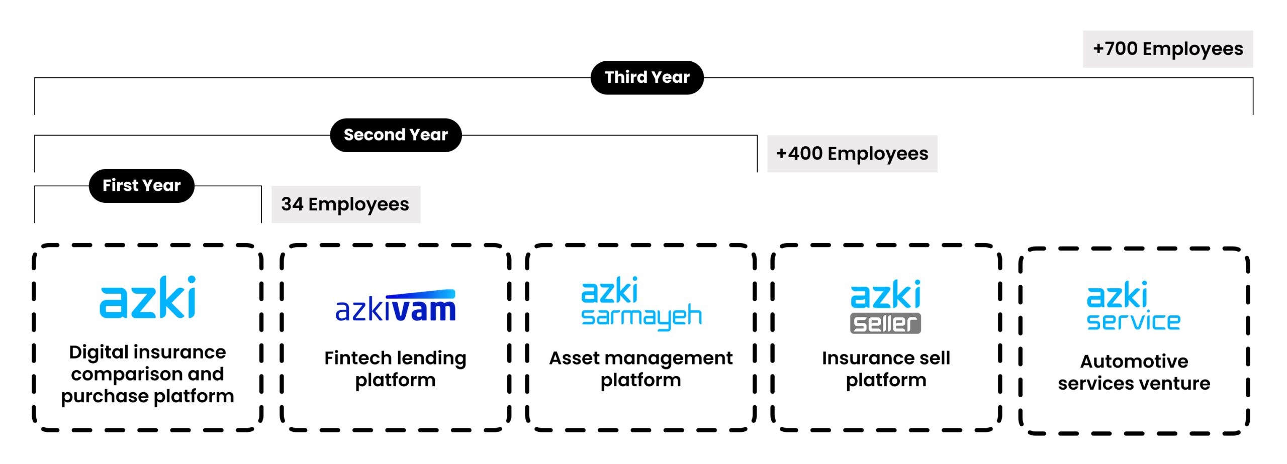
When I joined Azki as a senior product designer, there was only one venture (an insurance aggregator tool). The team was only 34 people. In the second year, it grew to 3 ventures and 400+ employees; in the third year, Azki had 5 ventures and 700+ employees. I was responsible for creating and managing a design system to support and cover this scaling and new ventures.
My approach
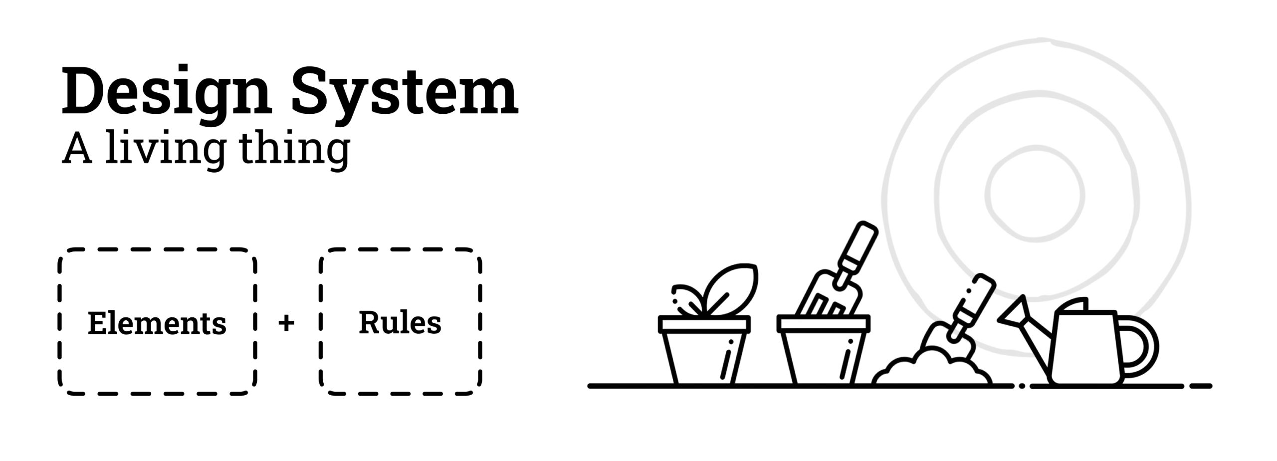
believe a design system is a living thing; it needs supervision and care. Design system is like a garden in my mind. It starts with a bare patch of soil and grows into a lush garden by planting seeds and caring for them. Caring for and maintaining a garden requires planning and scheduling. But it is undeniable that, above all, we need good soil for the beginning.
On the other hand, the main thing that distinguishes a design system from other things, like a UI kit, is the rules. The rules are the base, and they are the ‘whys’ in the Golden Circles (as I described in my blog); Those rules are the caring and supervision of the design system garden, and the Golden circle approach is the sun.
Process & Workflow
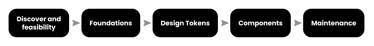
The creation process of Azki’s design system had many details and challenges. Here, I will describe them concisely. The flow I used for creation was as follows. At each step, I tried to maintain consistency and follow the approach I described above.
Discovery and feasibility
When I started working at Azki, there was no design system, and there was a lot of variety and inconsistency across all products. My discovery started with a complete investigation. I did the following to make sure I had enough data to start:
Foundations
Everything is progressing at a rapid pace. A benchmark is about the things that help us avoid reinventing the wheel and starting from nothing. I studied 7 design systems from large companies with multiple products. I tried to see them like this:
What did they do? → Why did they do that? → What was the result?
Also, I studied these documents to stay up to date and design the Lighthouse in line with the latest guidelines and standards.
1- Web Content Accessibility Guidelines (WCAG) 2.0
2- Material design as document
3- Other sources (IBM, Spotify & etc.)

After gathering all this data and documents and analysing them, I identified the limitations on both the technical and business sides, as well as the roadmap I should follow. The most important thing that I had to consider was from the technical side. Most of the front-end code and product lines were developed with MUI, and it was unwise to change it or recreate the main components from scratch. So the final decision was to keep the MUI and update it where it was needed.
So this meant that I had to use MUI standards for the following:
1- Names and terms
2- Structures
3- Layouts
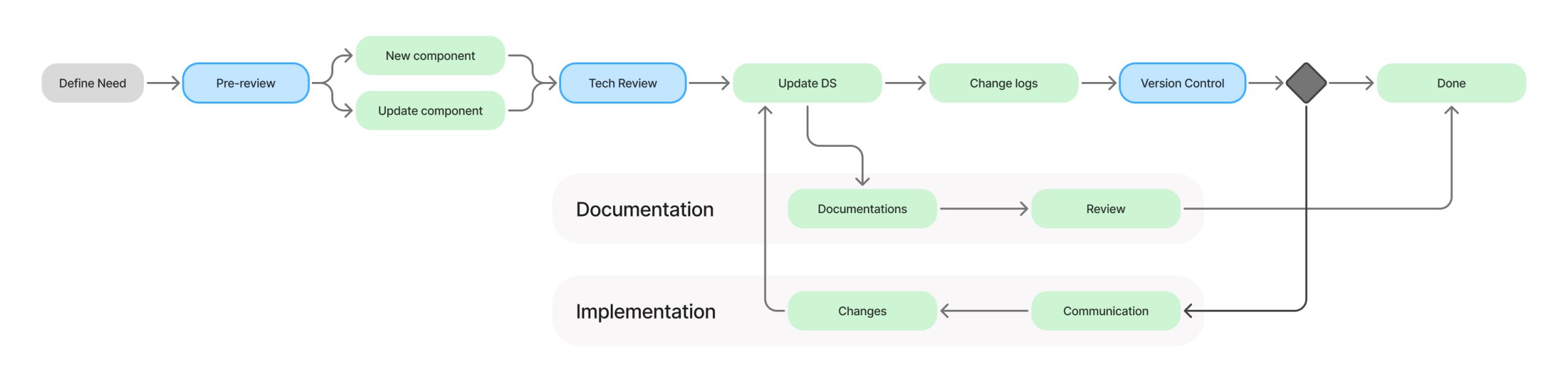
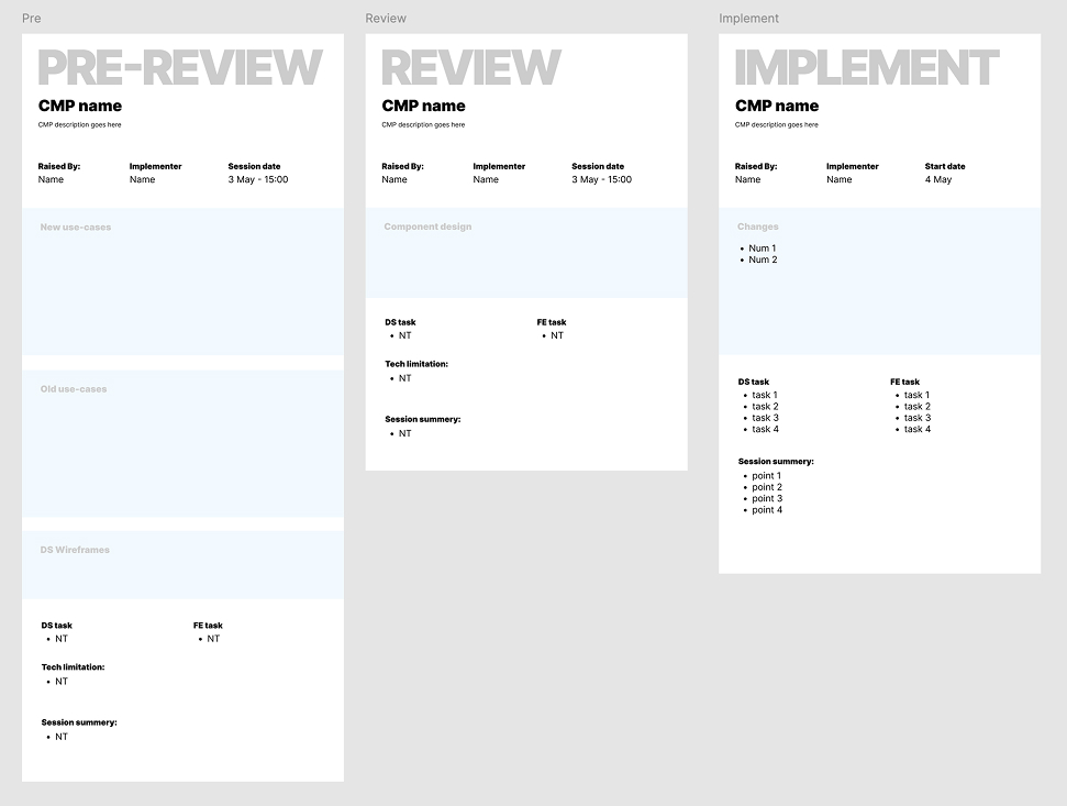
As I mentioned earlier, for the creation of a good and stable garden, we need good soil. I translate the soil for a design system to flow and for its usage. I needed to make sure that after the design system was created, all teams and designers would use it correctly. To achieve this goal, I created flows and onboarded everyone who might be interested. Here is the flow:
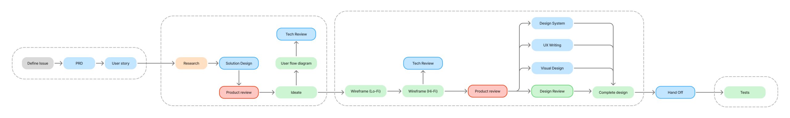
I have to mention that this flow has been updated many times to find the best form. Most of its updates were for a time when I was promoted to a design team lead.
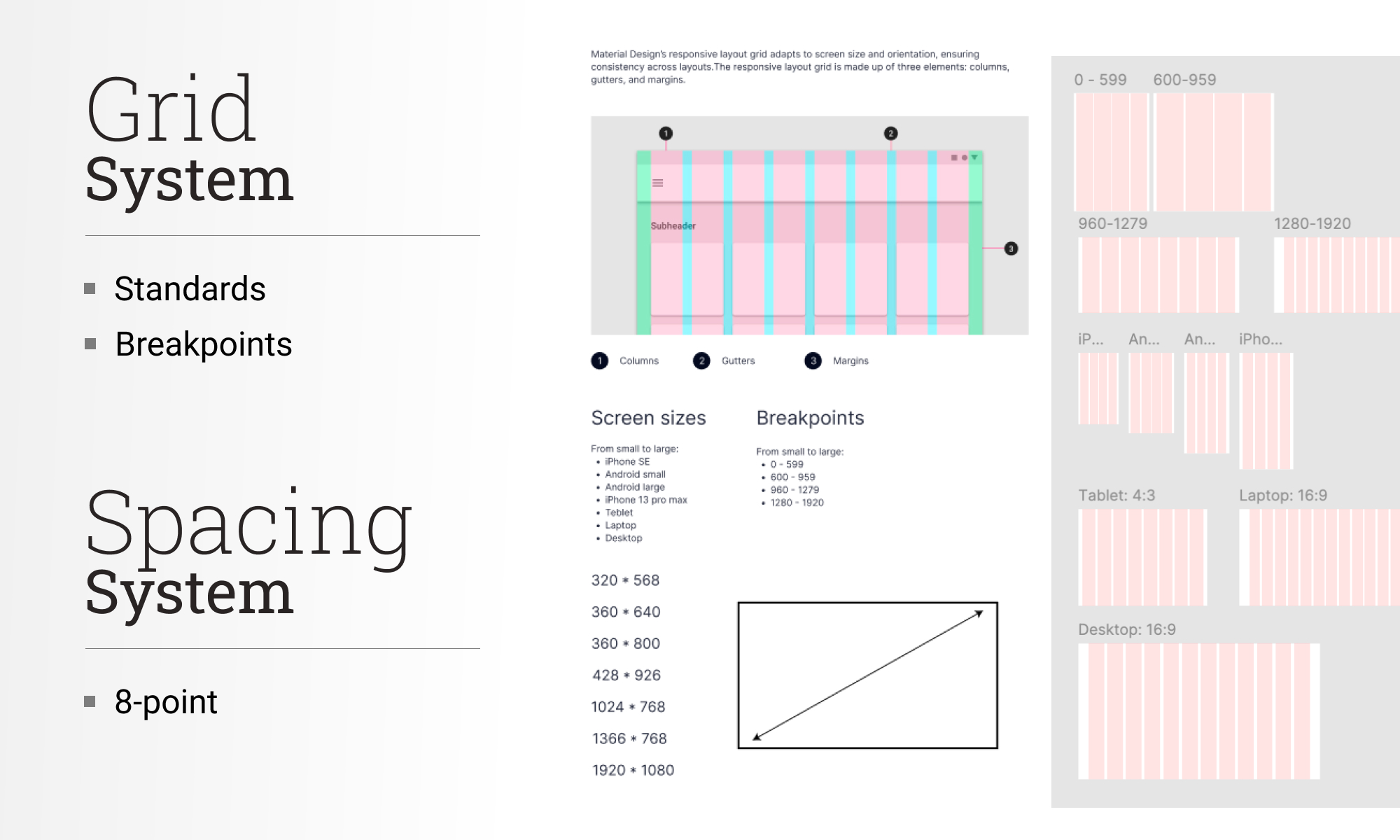
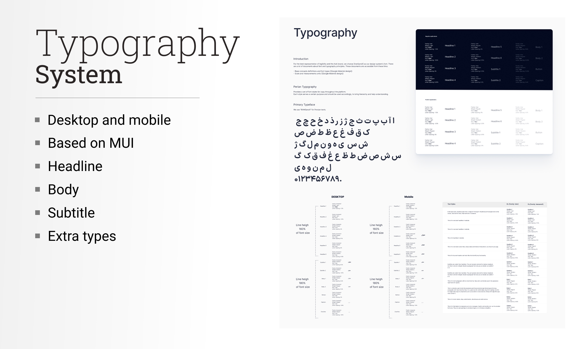
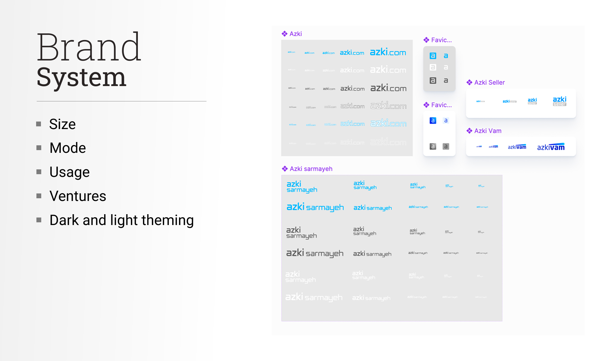
Design tokens
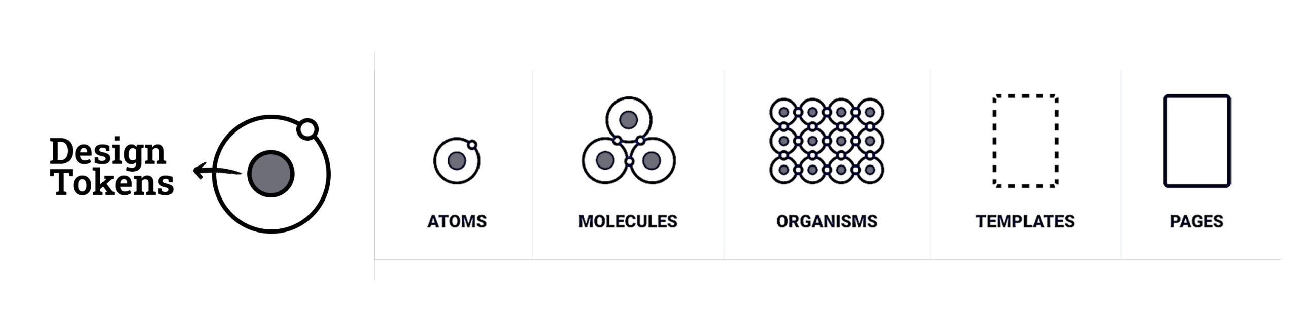
Design tokens are the basis of a design system. In creating design tokens for Azki’s design system, I had to overcome many challenges, which I will discuss later. I used the Atomic design method for the Lighthouse.
Here is a brief overview of the Lighthouse design tokens. The documentation of each was complete and comprehensive. We had an in-house documentation system based on Jira and Confluence; I documented everything there.
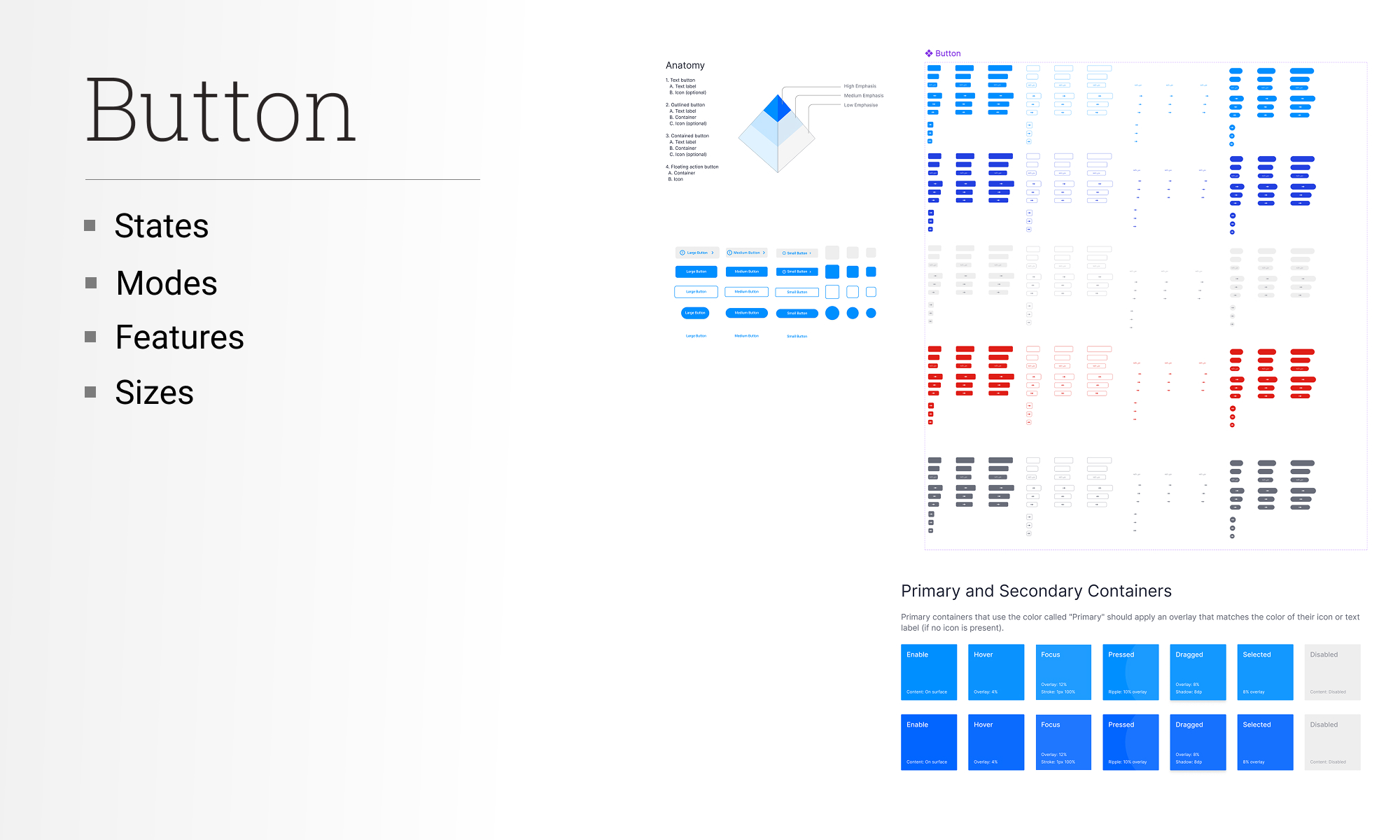
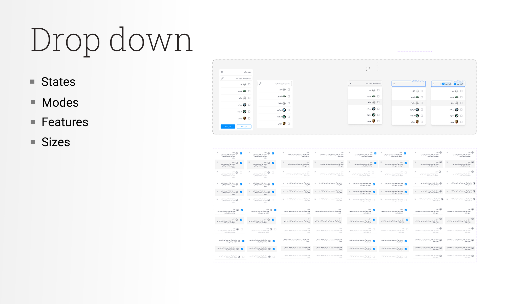
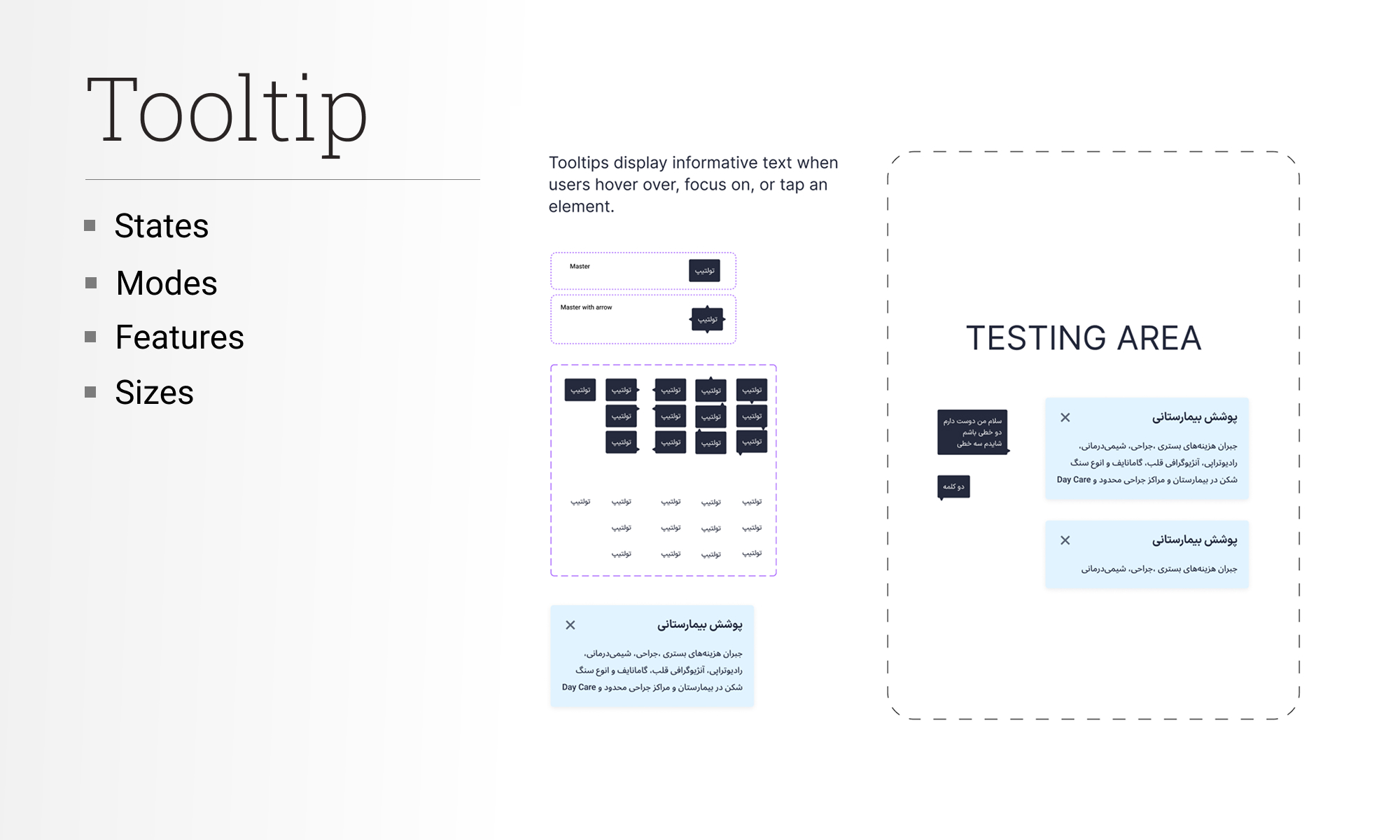
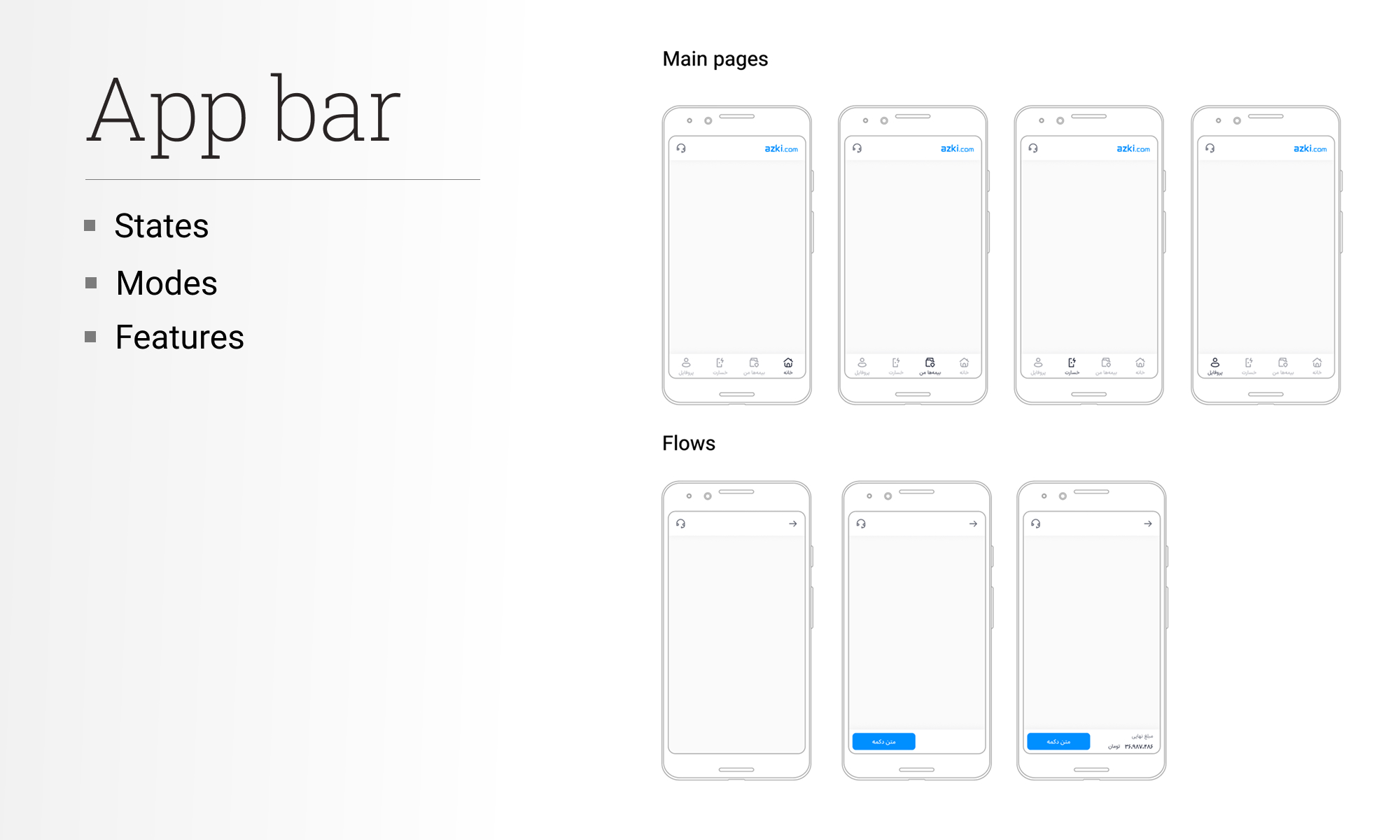
Components
I divided the components into two categories: basic and non-basic. The basic ones are mandatory for any user interface, such as buttons, inputs, and radio buttons. The non-basic components are those that are exclusively designed for product lines' needs or require significant customisation. For the first category, I held detailed yet concise meetings with the front-end team to move things along faster. These meetings helped me emphasise to them the importance of the design system and how it can make everything easier.
After the first category was implemented and all team members had a better understanding of the process, I created this flow to shape the communications and make them purposeful. The feedback and experiences from the first step helped me a lot.
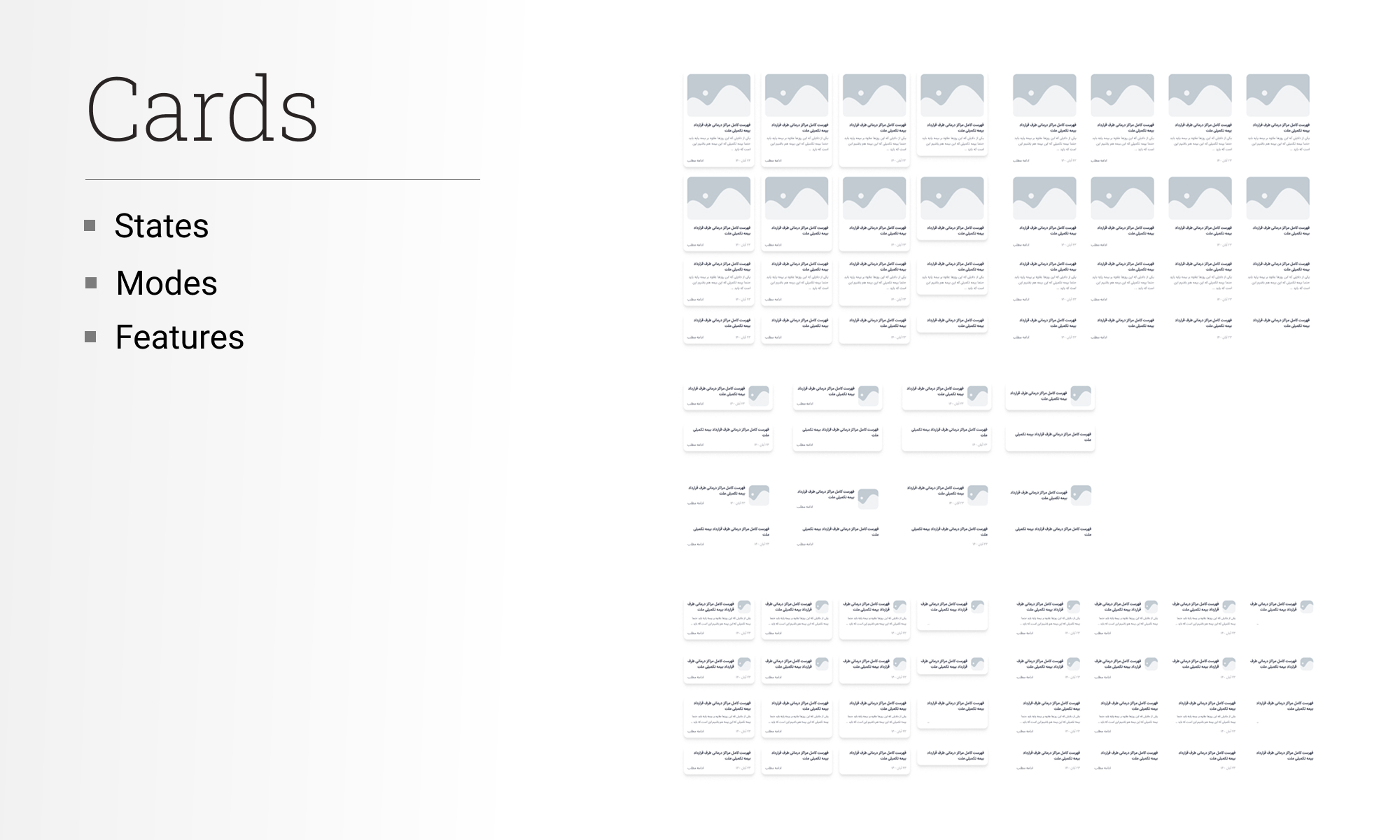
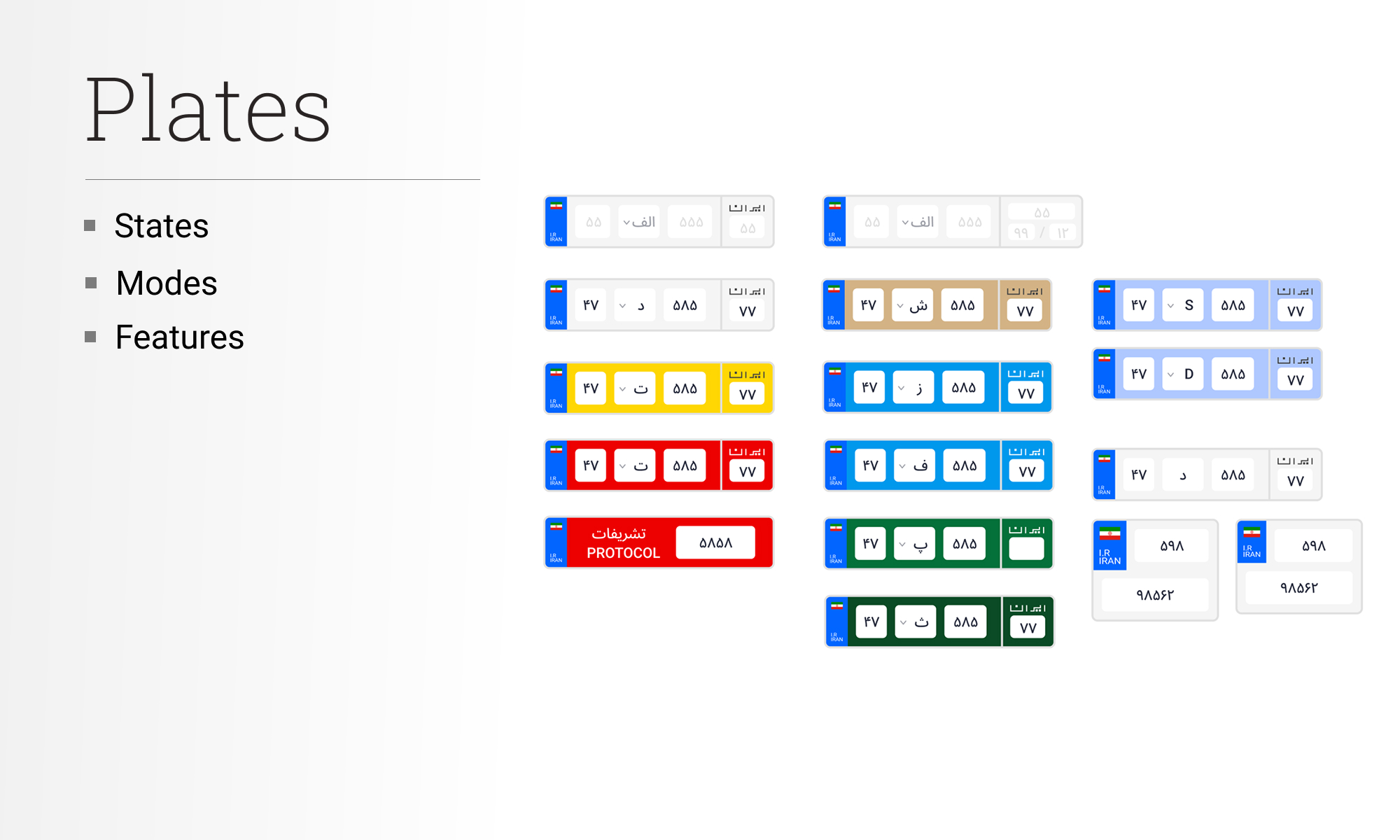
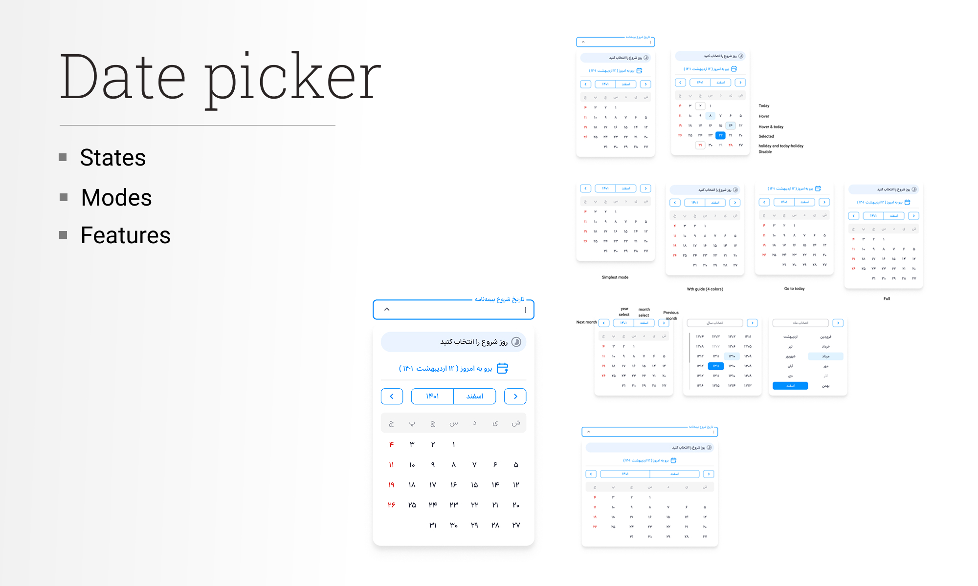
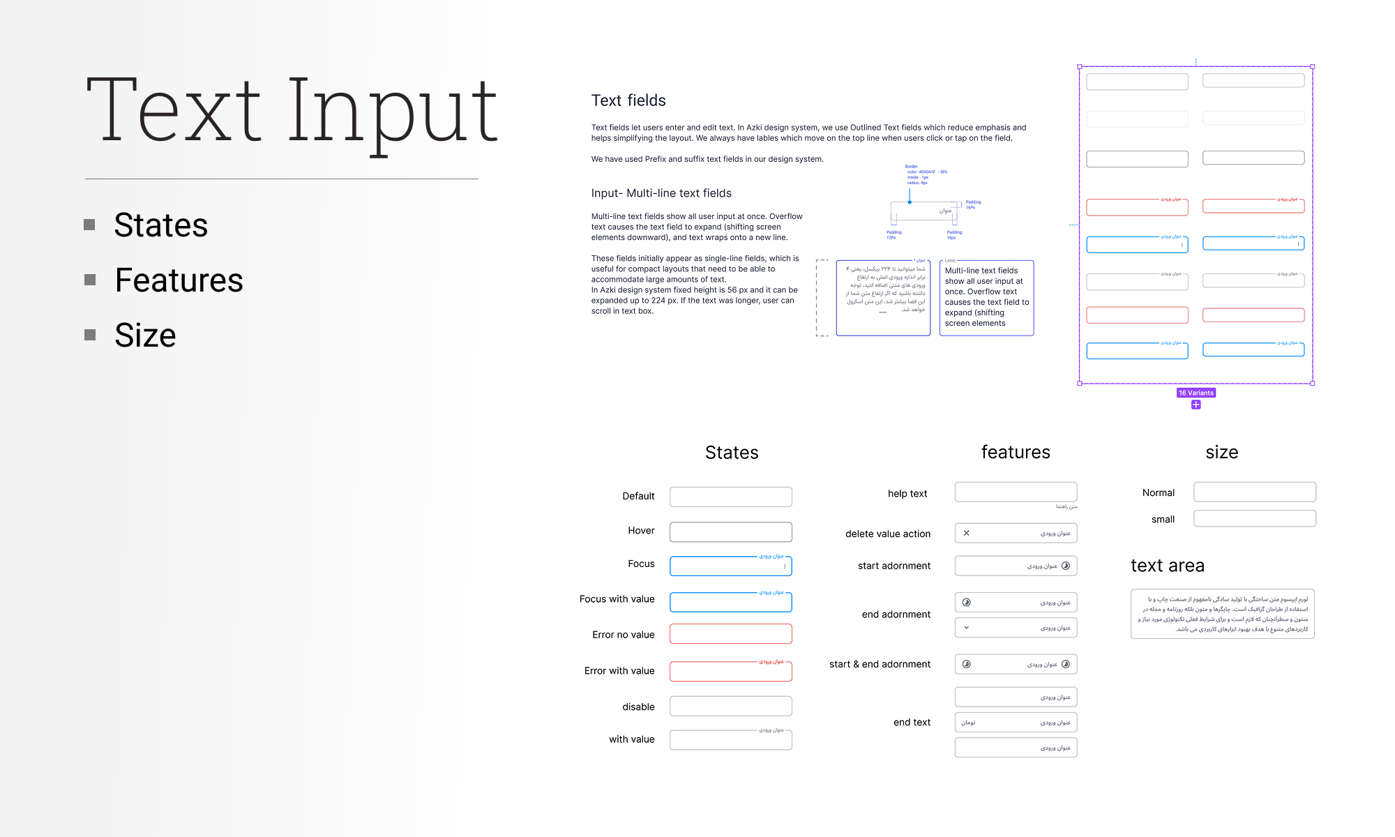
Here are some examples of the components.
Maintenance
Maintenance is inseparable from any product, as it is in the product design process; it is a loop. Lighthouse had major updates during the time, especially when new ventures were added. The following are two examples of those updates.
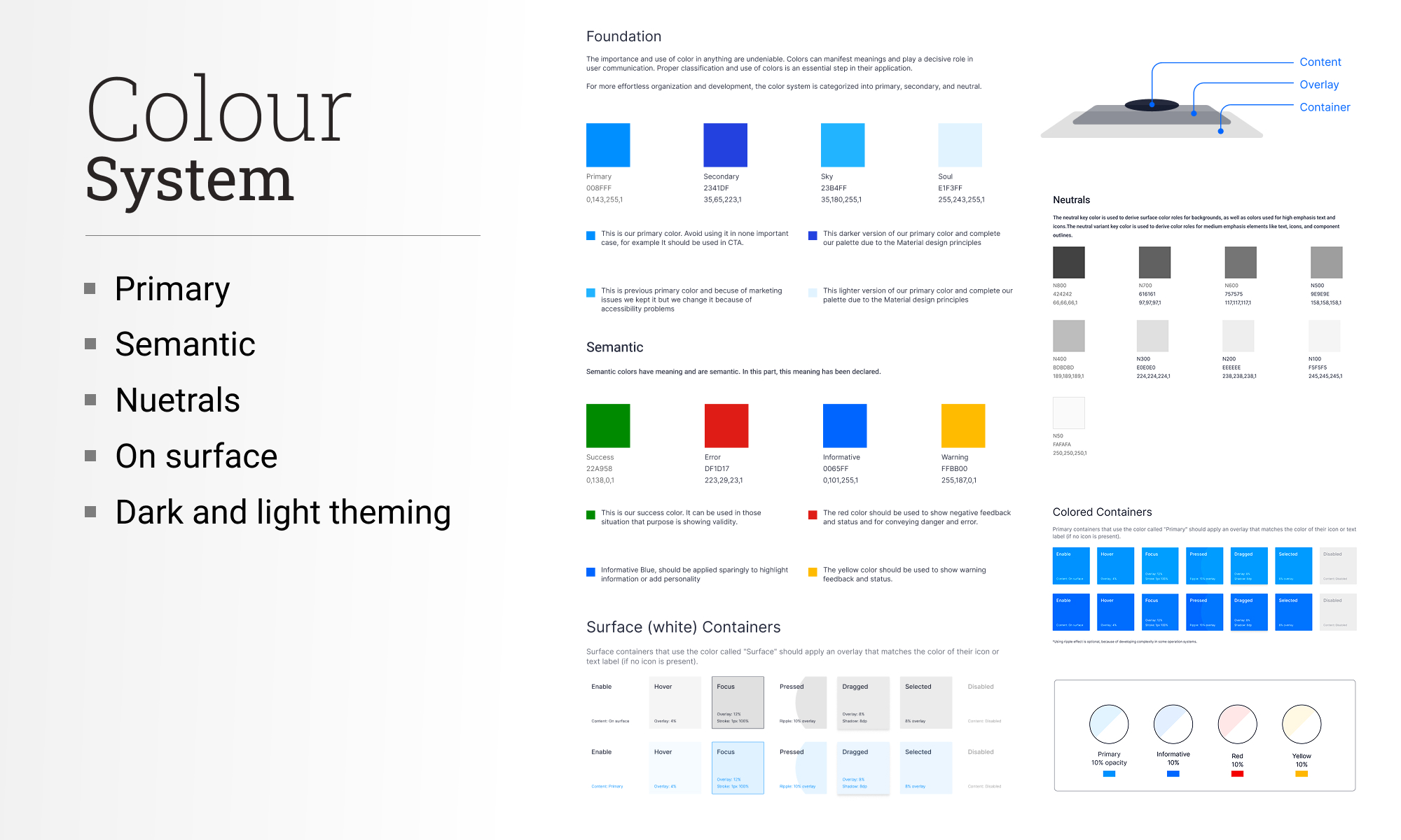
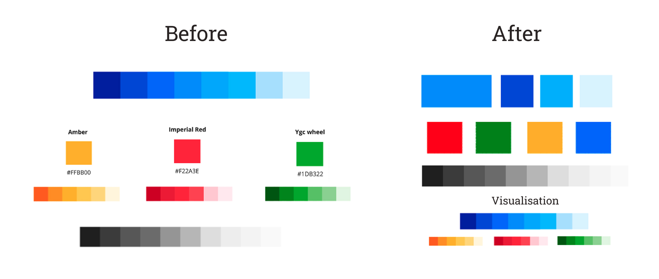
Colour system: Initially, I created the colour system based on MUI structure and standards. There were 8 shades for the primary palette. During that time, I saw confusion and misunderstandings among product designers about how to use those shades. After a complete research, investigation and study of the issue, I decided to use the transparency method instead of shades. With this solution, I reduced the count of colours in the primary colour palette to 3 and in the semantics to 1. On the technical side, we used the transparency of our black and white colours to handle interaction states, but for the visual design team, I kept the previous palette.
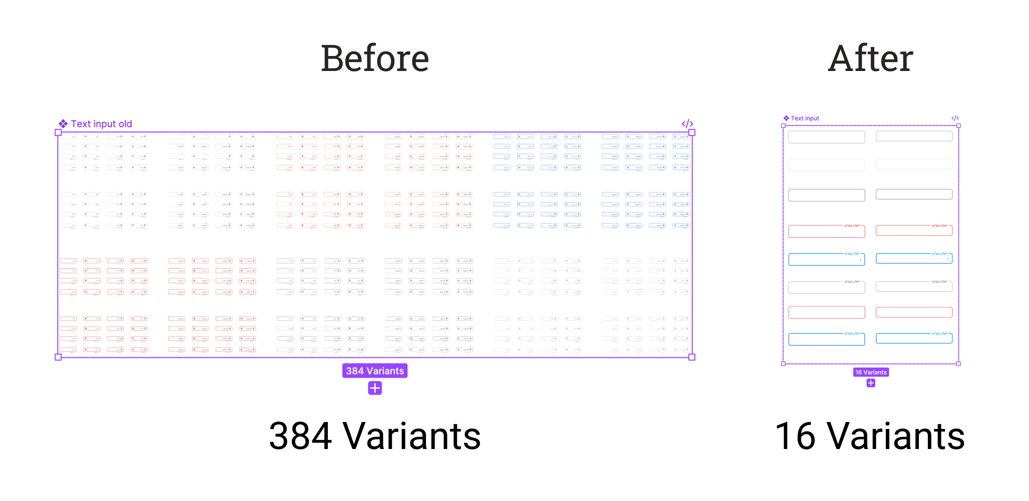
Variants system: When I started Azki’s design system, Figma had limited features for creating and managing variants in a component. After about a year, Figma added more features, and I updated components and their structure continuously based on the latest methods and features. One important example was the ‘Boolean property’; here is a sample.
Challenges
A design system, as a living thing and a pillar of digital product design, can be very challenging in itself. It is important to keep it up to date and well-documented, as I described in previous sections. Lighthouse, as a multi-venture design system, was more complex than a design system for a single product cycle or a single venture. I tried to overcome all of them through clear and continuous communication plus constructive collaboration. I mention 2 examples of these challenges that make more sense without knowing the business details.
Brand merging
My joining the company coincided with the merger of two brands, Azki and Bimito. This situation had caused serious challenges in creating a new structure, brand name, identity, colours, mascots, etc. The main obstacles were the brand's main colour and uncertainty in decision-making. I could solve this challenge by creating and presenting slides to all stakeholders to help them choose the right thing. They decided to keep the Azki name and apply Bimito’s colour and identity to it.

On the other hand, I had many meetings with the marketing team and the CMO to convince them to change the Bimitos colour to make it accessible.
Front-end framework
As I mentioned before, all products were implemented with MUI, and I had to consider its limitations, but the bigger challenge came when we needed a new design for a component that had already been used in another part of the product lines. For example, for the redesign of a certain flow, we needed a better ‘stepper’ component, but this component with the same logic (in the MUI system) had been used in other places. So I had to consider all of its aspects and be prepared for its consequences. After some trial and error, I found a good solution. I added 3 cards in each component document that showed everything about it. Its previous usage, summary of technical meetings, next steps, etc.
Outcome & Reflection
believe the most important success metric for a design system is operational efficiency, which is really hard to measure, especially when quantitative data are needed, and there is no prior stage for comparison. However, there are some signs and results that we can consider as direct effects of a good design system.
Azki’s design system, more than its main duty, structured the design process. It was because of the approach I used that we needed good soil! In other words, the usage of the design system and the processes are important too.
Fully dynamic design system with +100 components with complete documentation.
Scale and support design system for 5 ventures with more than 10 product designers.
Reduce the task cycle time by 34% using the design system (comparison of the second and third years).
Improve design-and-development back-and-forth and execution time by optimising the design system implementation process by 50%.