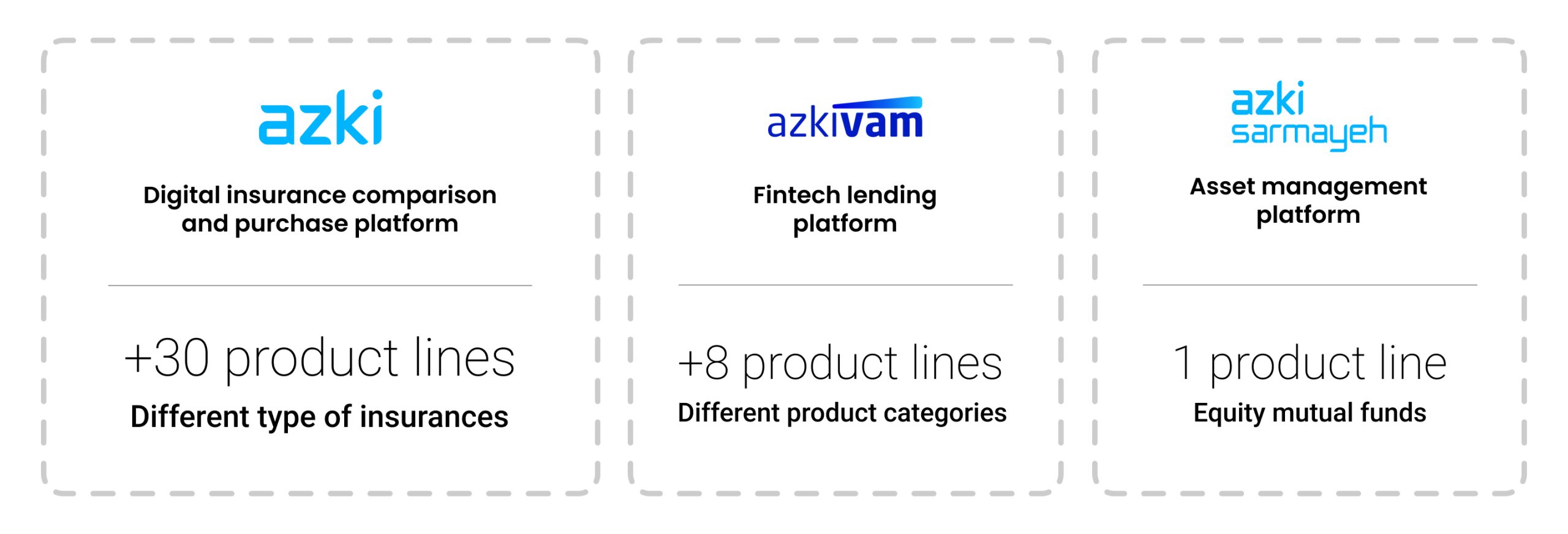
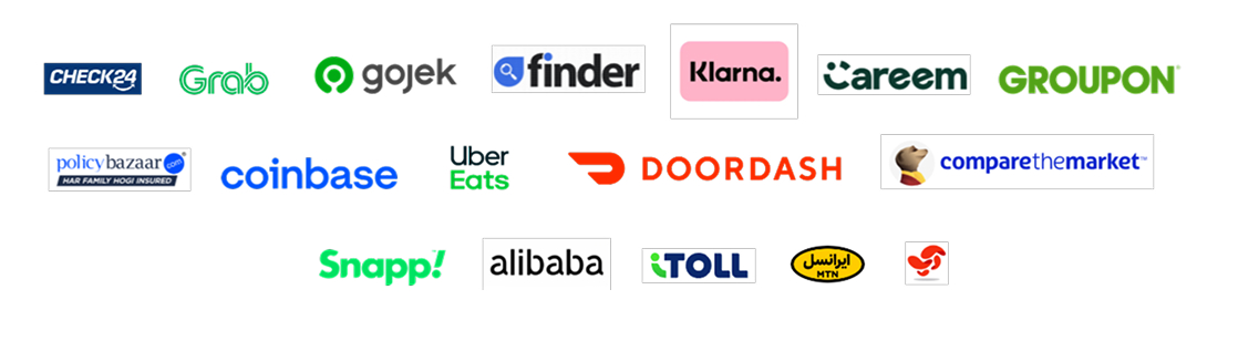
Azki is the leading insurtech company in Iran, with more than 8 million users and over 8k insurance policies sold daily. Azki has another venture, including Azki Sarmaye, Azki Seller, Azki Vam, and Azki Service. I described Azki's progress and scale in this project in detail.
At the end of the second year, when 2 of the other ventures had matured enough, stakeholders decided to promote them alongside the main venture (insurtech) as a unified service. Also, the main venture had added new product lines too. So we need a new solution for the Azki.com home page!
Results & Impact
+95% engagement rate for new services
2X average engagement time in home page
+17% average improvement in product-line discovery in insurances
Problems & Goals
As a large company and holding, Azki is continually expanding its product and service offerings. Therefore, Azki's macro policies and long-term plans have always focused on expanding and diversifying its products and services. In other words, Azki aims to become a high-quality super-app focused on fintech, insurance, and investment.
This redesign was the first and most important step towards this goal. Among these 3 ventures, Azki (Insurance) was the most important, since it had by far the most users, but it was vital to properly introduce the other 2 as well.
Based on what was said, the sensitivity of this page was very high. I had to design a new thing without bothering the existing users of Azki (insurance). I prepared a detailed document outlining the roadmap, my plans, and the goals, and I submitted it to the managers for approval. Here is the summary of the goals and also the metrics I had to satisfy.

Maintaining experience quality
The new design had to avoid harming the prior experience while improving it. Since the new design also had to promote the new insurance lines.

Scalability
As I describe in Azki’s macro policies, the solution had to be scalable to accept new ventures and product lines easily.

Optimised functionality
Based on the venture's needs, each one required an interactive section to display its data dynamically. These sections had to have enough space.

Effective introduction
All ventures needed areas to use for their marketing purposes. The areas had to be diverse to have flexibility in different campaigns and priorities.
Based on what was reviewed above, the problem statement can be summarised as follows:
Creating a flexible, expandable structure to accommodate and display various services, with suitable potential for interactive, marketing, and content items, for the Azki homepage as a growing and popular platform.
Challenges
In addition to the sensitivity of this project, as mentioned, another important challenge in redesigning this page was to simultaneously preserve Azki's previous user experience as a tool for comparing, selecting, and purchasing insurance online, while creating the capacity to develop and add other services to this page. The presence of services with numerous, varied features and interactive components in each made it more difficult to design an integrated and coherent space. On the other hand, implementing this space in the limited web and PWA environment on mobile made this path more complicated.
In general, the challenges can be summarised as follows:
1- Preserve the previous user experience of Azki as a service for comparing, selecting, and purchasing insurance online
2- Create a comprehensive and scalable solution
3- Integrate and create coherence in displaying all services
4- Manage time, resources, and stakeholders with consideration of constraints
Approach
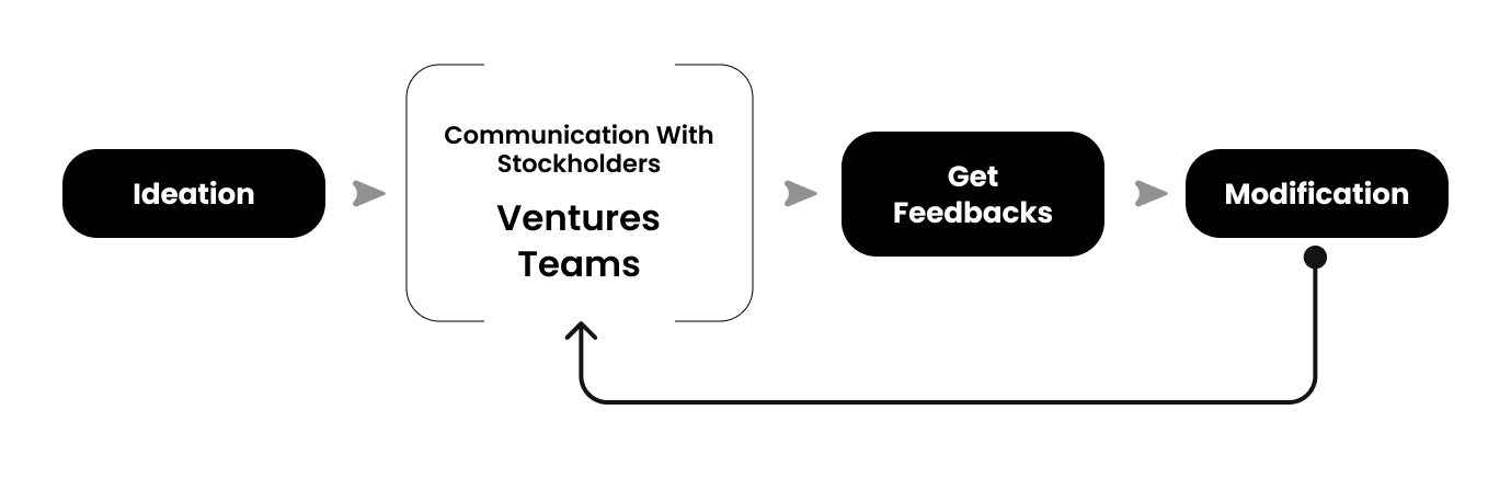
Since this design had to satisfy 3 Ventures, communicating and its speed were vital. Instead of one group of stakeholders, I had 3 groups of managers. To overcome this challenge, I used the ‘early feedback’ method to move quickly without sacrificing quality.
Ventures: Azki (main - insurance), Azki Vam and Azki Sarmayeh
Teams: Tech team (front-end and back-end), marketing and design team
Since this design had to satisfy 3 Ventures, communicating and its speed were vital. Instead of one group of stakeholders, I had 3 groups of managers. To overcome this challenge, I used the ‘early feedback’ method to move quickly without sacrificing quality.
In this project, I selected different types of products to diversify the items and assess various approaches and solutions, since the goal of the redesign was not exactly a super application. The goals and objectives were similar, but the situation was totally different for Azki.
In examining each option, the following points were analysed:
1- Layout and prioritisation: How to arrange the main and secondary services according to their importance to users and business has been and is a fundamental issue in superapplications.
2- Space management: How much space does each service have, and what internal components does it have?
3- Differences between mobile and desktop: How and why the chosen solution was implemented on each. How were the specific limitations or features respected in each form?
4- Adaptability and dynamism: How does the super application structure change over time, and how does user behaviour affect it?
Solution
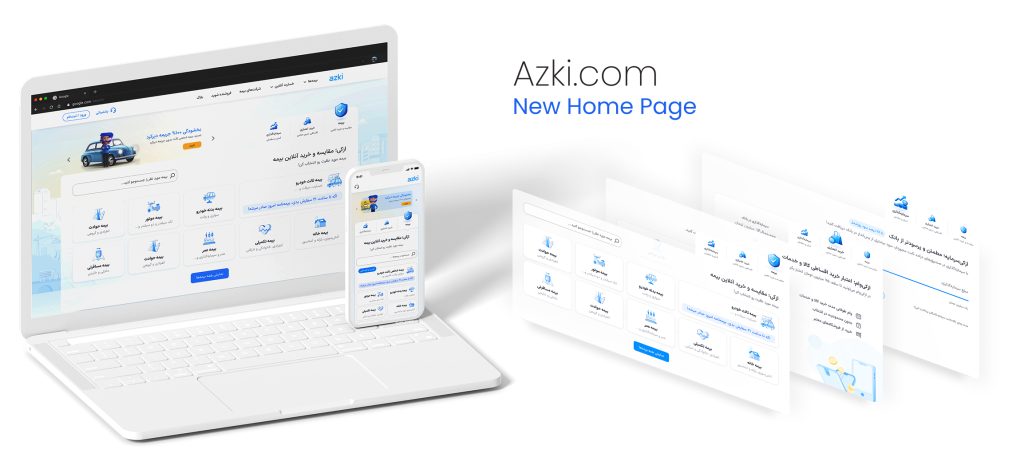
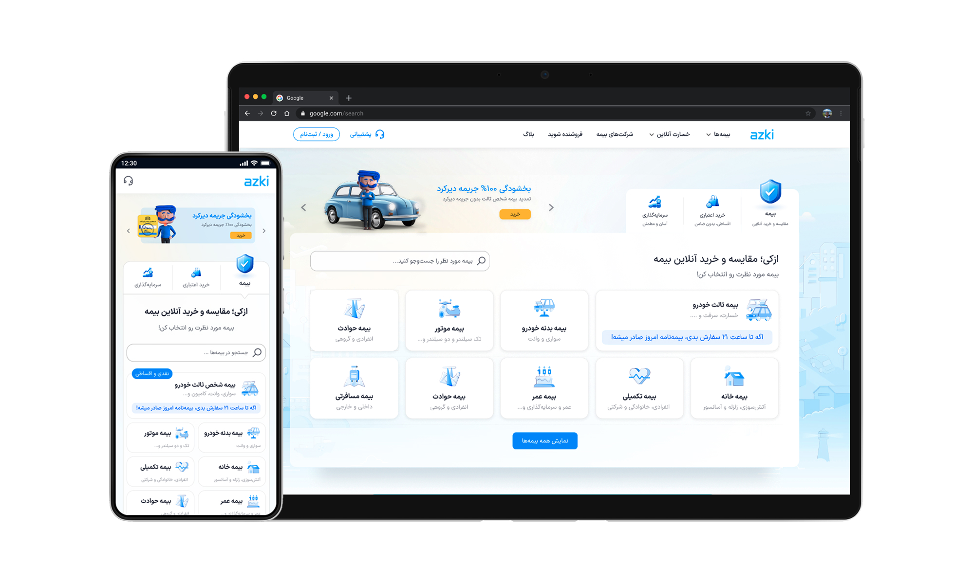
After ideations, research, and collaboration, the final solution was designed on time and as planned. I will describe the solution in 4 sections. Here is the solution structure for the mobile and desktop versions of the hero section (the most important part of this redesign).
Based on input from C-level managers and the SEO team, it was decided to keep the home page content focused on insurance services and to add a section to introduce the other venture services as needed. So the rest of the home page had only minor updates from the previous redesign.
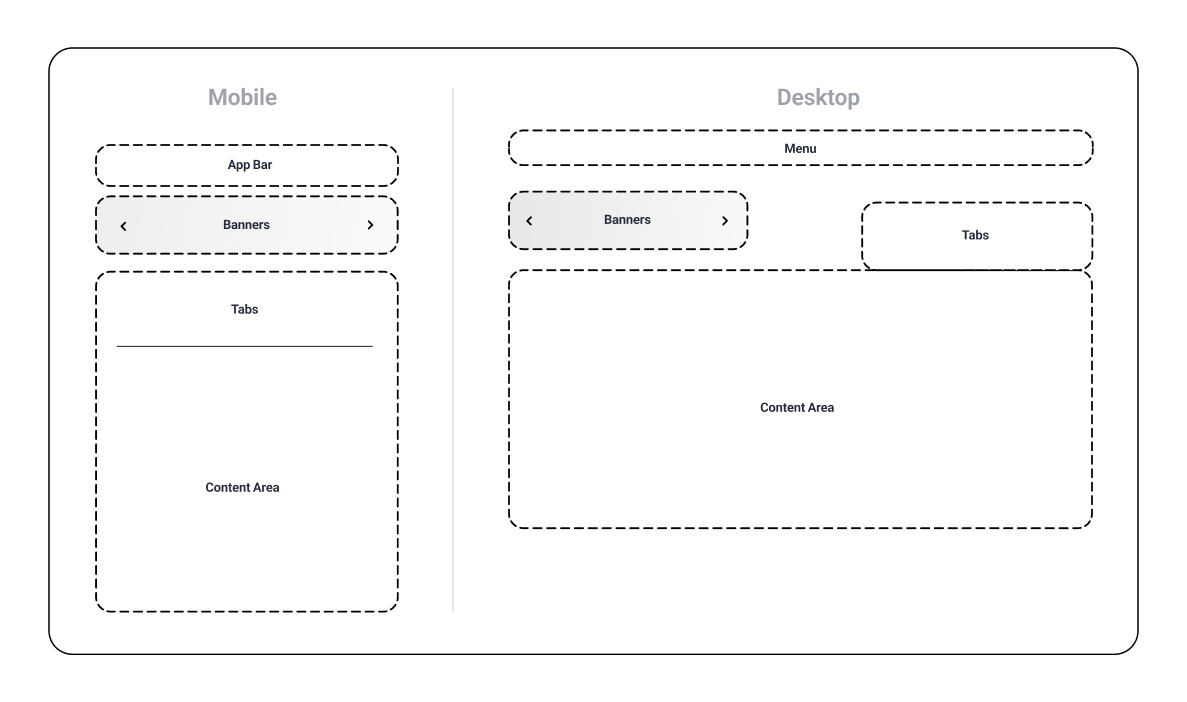
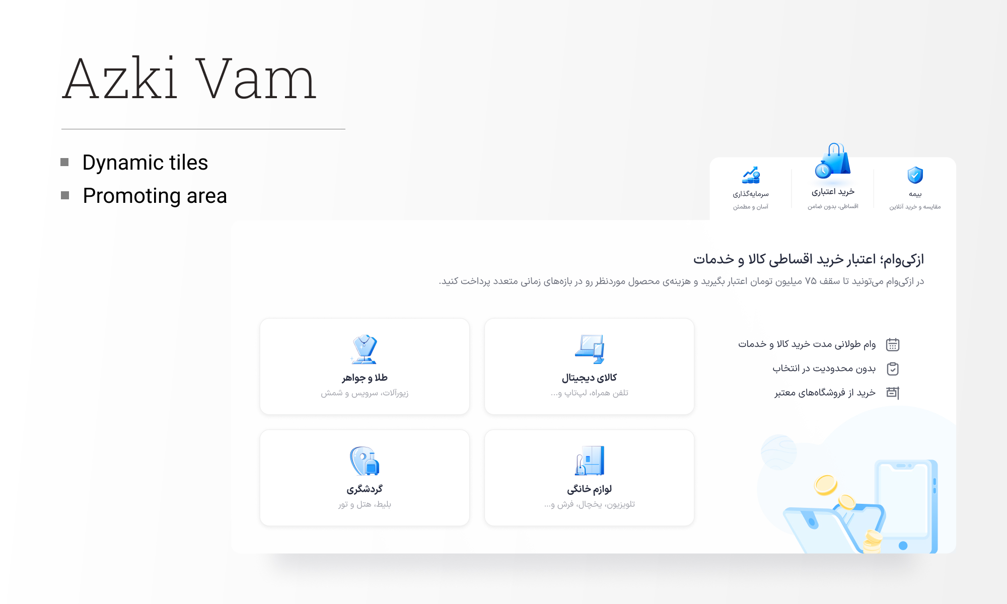
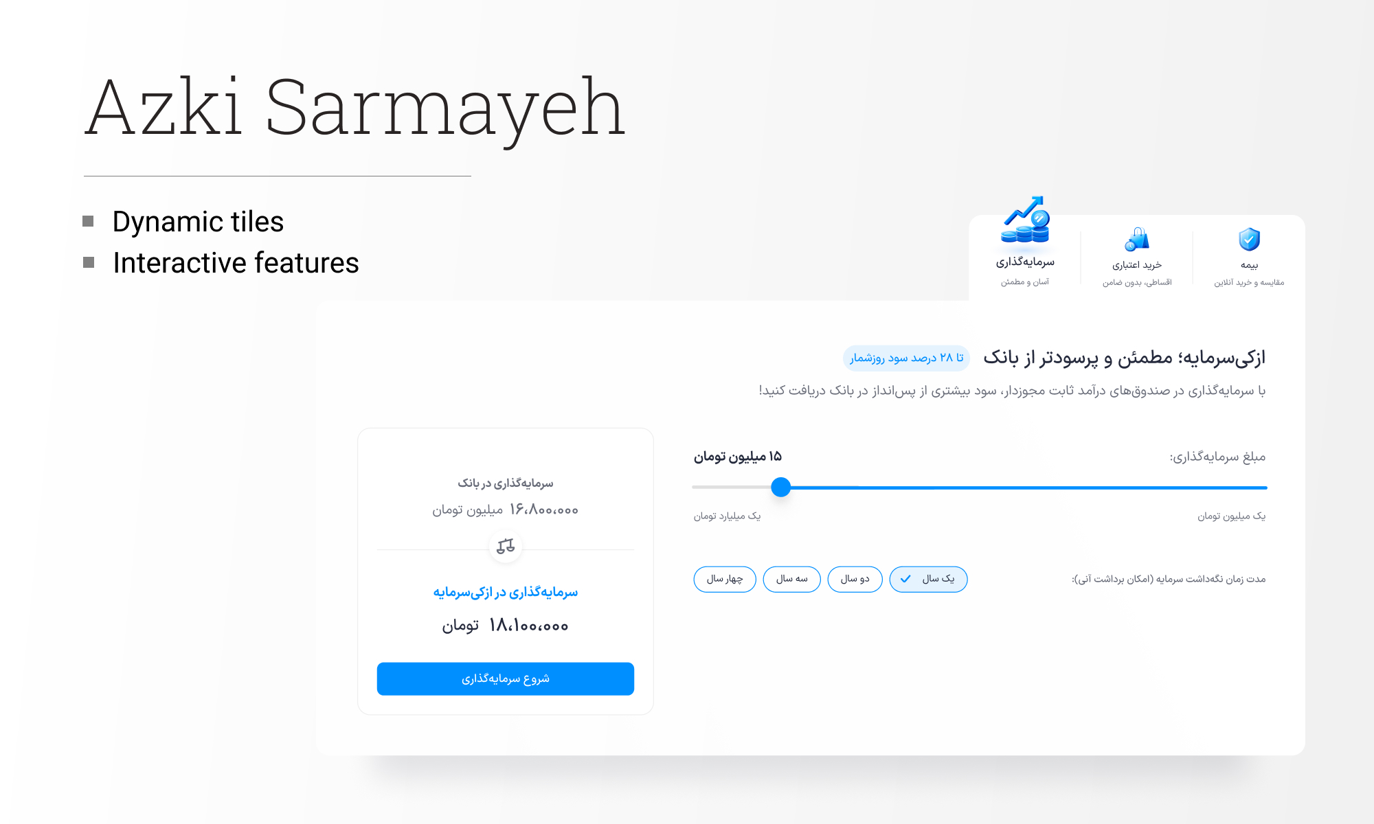
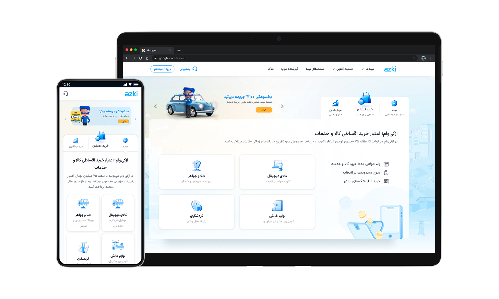
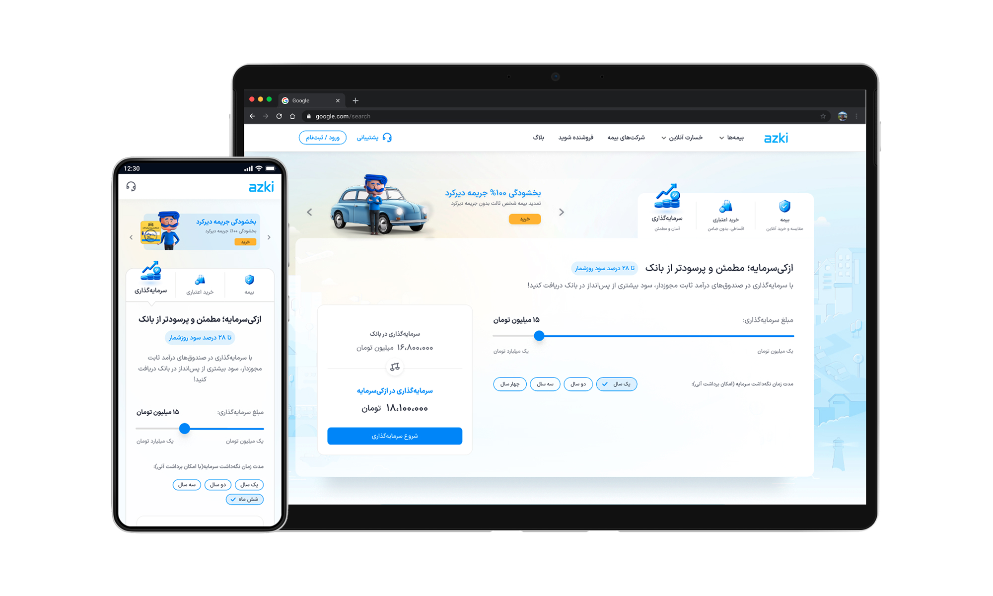
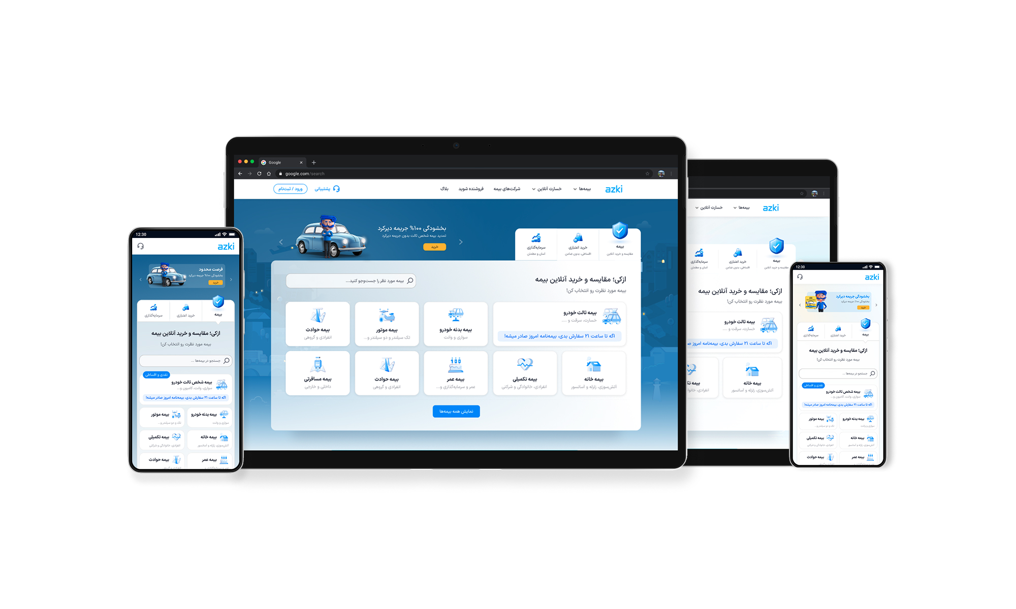
Tab design
After analysing and considering all the data I had, I decided to go with a tab design structure. I chose this solution because of these:
1- Tab has enough separation and functionality to suit this project, and I could put the insurance service in the first tab to ensure the prior user experience with Azki.com remains untouched, and all users will not get confused.
2- Tab design gives maximum space in a single viewport, so I had sufficient space to implement what was needed.
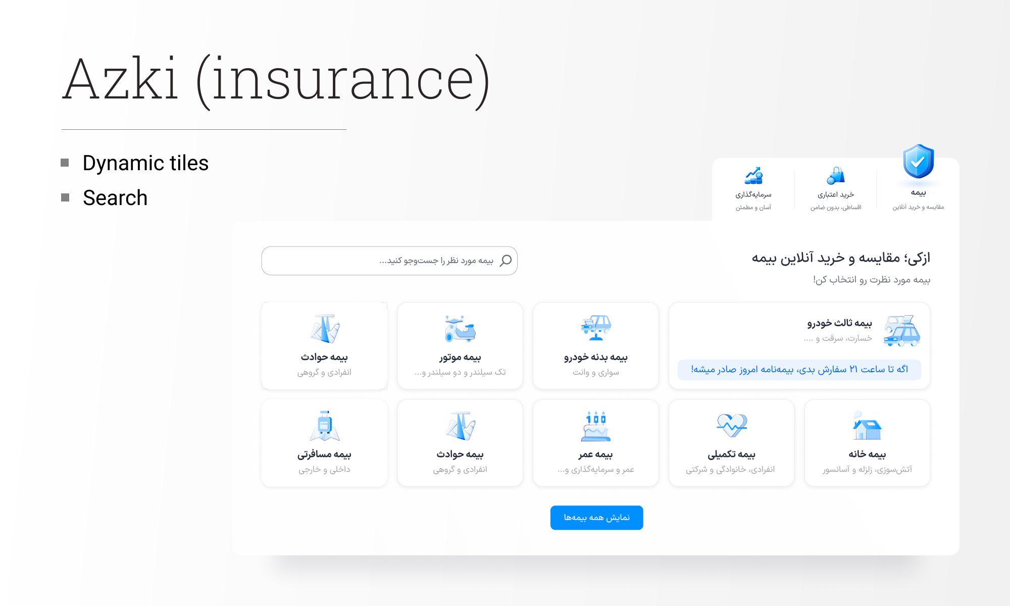
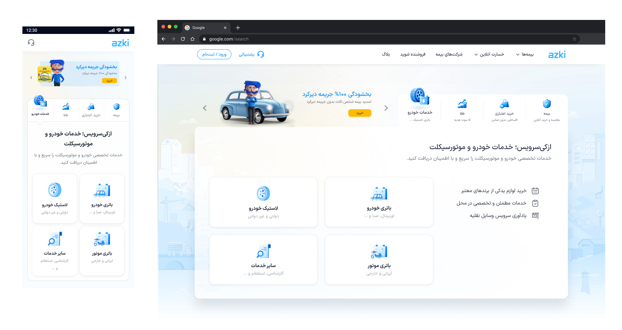
Dynamic grid system
I did another redesign of the home page before this project, but it was very limited and focused only on UI improvements. I made some changes to the UI, improving the product line grid system and adding features for marketing. I developed it further and added additional features to this project.
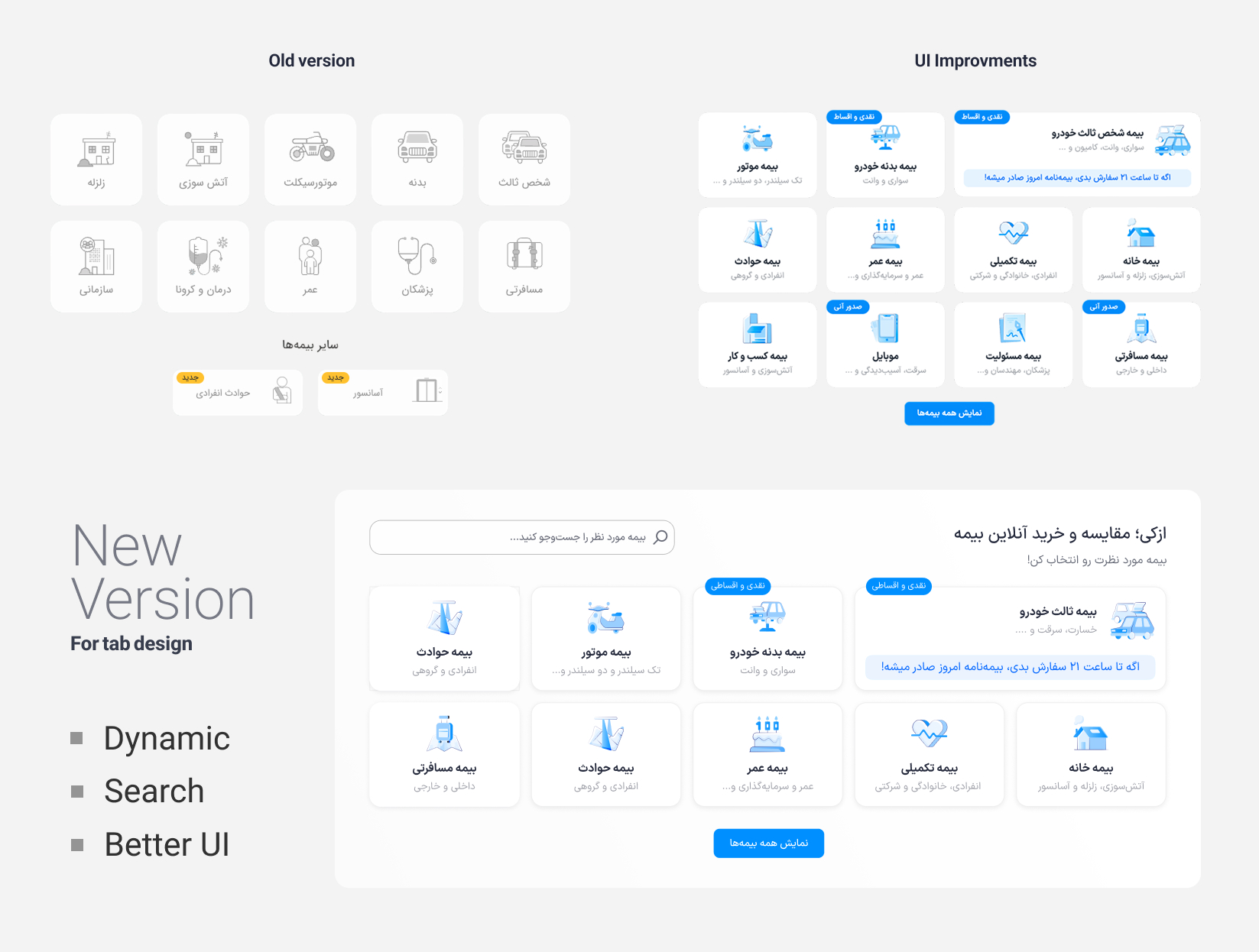
Dynamism: Insurance product lines for Azki were developing every month; it was mandatory to find a proper way to introduce them and make them accessible for all users. There were some factors that should be considered by default, for example, vehicle-related insurance (third party and body) that must always be shown or marketing campaigns about a specific product line. I designed a dynamic system to display the best possible tiles in the initial view. This dynamic system was documented with rules that translated into codes. The rules were based on these factors:
1- Business main product lines (I described above)
2- User behaviour, for example, search history, previous purchases, etc.
3- Marketing campaigns4- New product lines and services
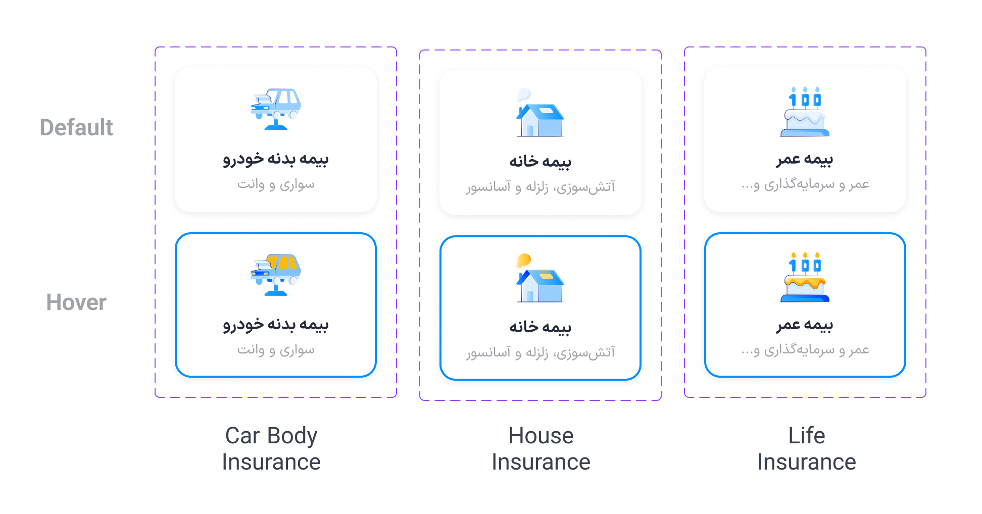
Better UI: I improved the tiles' UI to be more interactive, working with our visual designer. Added short animations and better hover status.
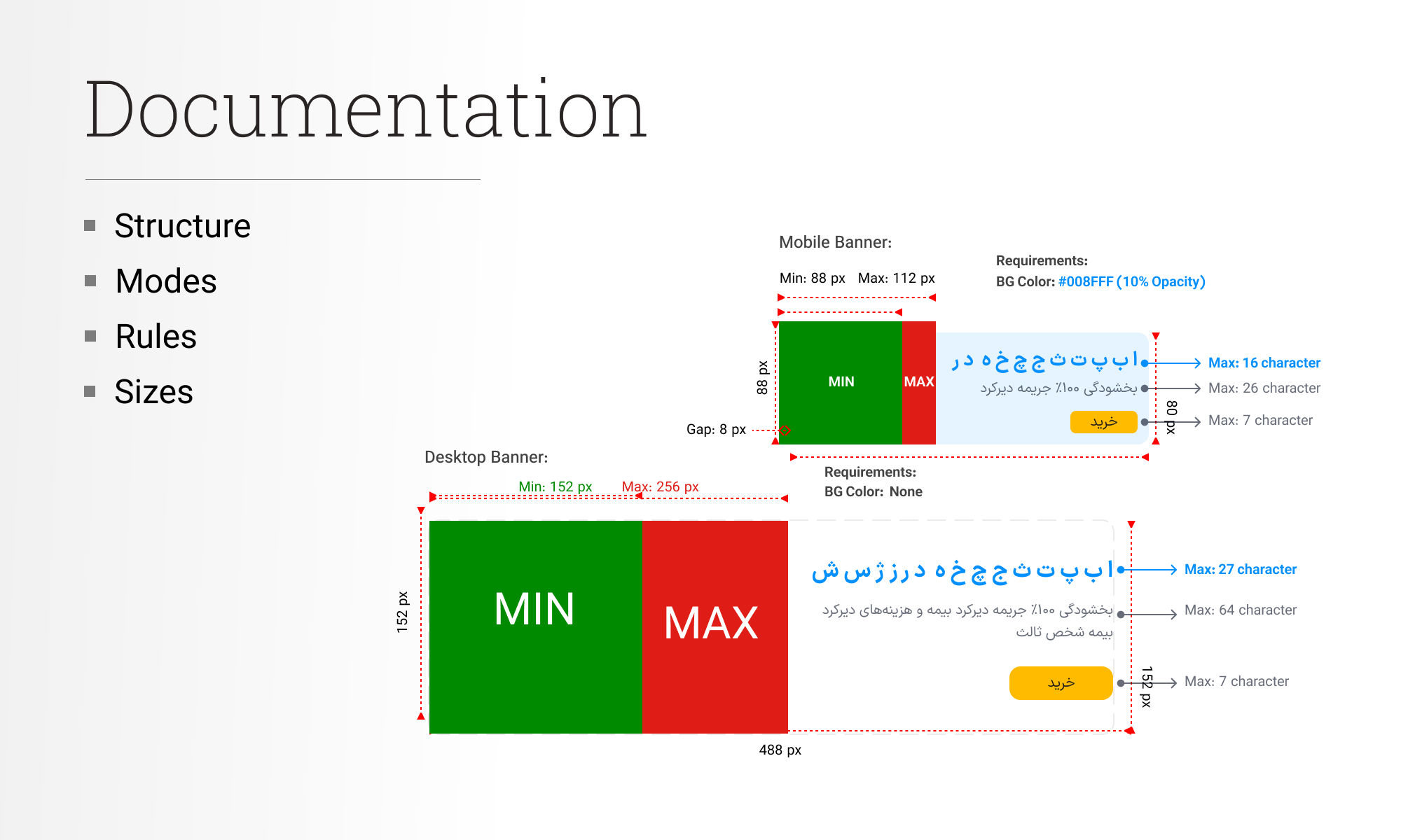
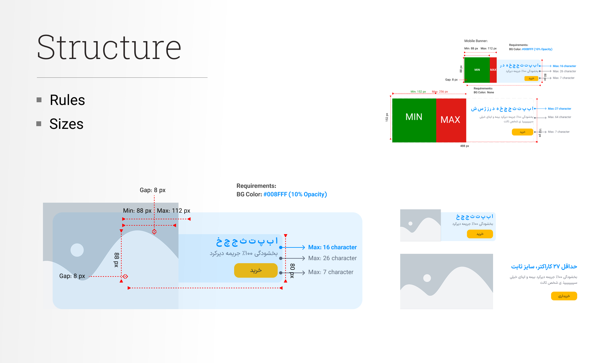
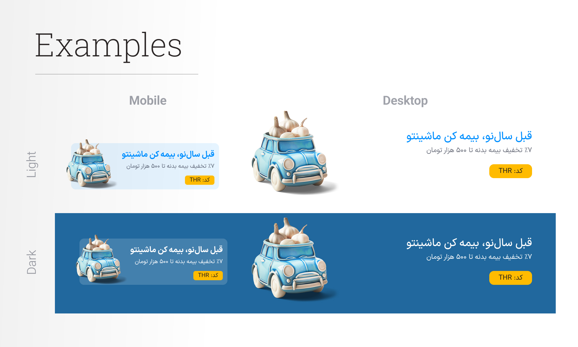
Marketing
One of the important issues on the home page was the areas dedicated to the banners. They were not effective enough and disrupted visual coherence. I created a comprehensive structure for marketing materials, including banners, pop-ups, and related assets. The banner structure was fully implemented in the code to improve loading performance and quality while remaining easy to update.
Tab's content
Here are the briefs and the final designs for each tab. I tried to have the best possible communication with stakeholders and product designers in each venture. By this approach, design a long-term, flexible, and scalable solution because changes and updates are the nature of scaling companies.
Tests and validations
Given the limited resources and time, and the importance of this project, I decided to conduct a very compact but determined test. I conducted a usability test with 6 people to ensure everything worked well, especially for Azki’s users(insurance). I chose the participants very carefully because they had to be users of Azki’s insurance service and had sufficient variety for validating the text. The items examined in the tests were as follows:
1- Finding insurance product lines in the new designs and new features
2- Functionality of each tab's contents
3- Accessibility of new services, banners and marketing materials
All main items were successfully validated, and all users completed almost all the tasks in the test within the proper time and interaction cost.
Also, to ensure the new design is scalable, I added another tab (the service that was not supposed to be added at that stage). Here is the design:
Outcome & Reflection
This project, in addition to all its complexities, challenges, stakeholder management, etc., was very important to me because it was a starting point for a major goal for Azki: becoming a super app and based on the results, I can say I did it successfully and overcame its challenges and obstacles with the solution I describe above.
Here are the final design screens for both mobile and desktop, in dark and light themes.
+95% engagement rate for new services
2X average engagement time in home page
+17% average improvement in product-line discovery in insurances