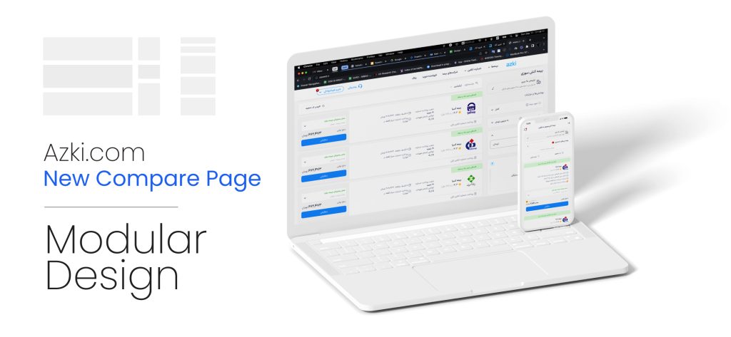
Azki, as a leading insurance aggregator, has a clear flow to help its customers compare and select the most suitable insurance across different types. Getting data, comparing and purchasing. There was a serious problem with the conversion rate on the comparison page, where all insurance products from different companies are displayed to users, and the user must select one to proceed to the next step. This redesign was targeted at improving conversion rates for this step.
Results & Impacts
21.57% conversion rate improvement in average (4 product lines)
97% improvement in implementation speed
Covered 4 product lines in less than 6 months including design and implementation
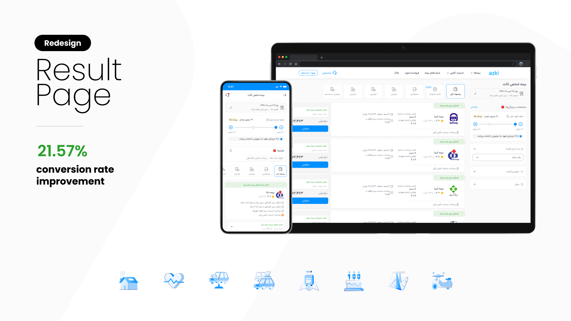
Click for full-screen view
Problems & Goals
It is obvious that the main flow of any application or service is the most important aspect to be cared for, because without it, the whole system will be useless in the end and will lose its users. As a product design lead, I always kept this monitoring and analysing of the main flow of Azki as a top priority.
Considering business insights, stakeholders' priorities, and many other factors, the plans and roadmaps are affected. I tried to maintain a balance between monitoring existing features and designing new ones. Azki was scaling at high speed, making balance maintenance more complex.
This is the main step of Azki’s core services: comparing and selling any type of insurance online. This flow was covered and onboarded to all teams, including marketing, business development, etc. In other words, for better coordination across teams, this flow was the pattern to follow.

I described here the home page redesign project that improved the first-to-second-step conversion rate, but the main problem was the conversion rate from the compare step to data entry. The conversion rate was only about 25%. But there were important points that prevented the product team from planning this page redesign:
1- Scaling and adding new services were more important by far for stakeholders to have more market share
2- Technical costs(poor capability of improving and scaling in back-end codes)
3- Significant variety due to the many differences in different insurance fields
So redesigning this step posed a high risk that needed to be managed, which multiplied the importance of having an efficient and flexible solution. Based on what was mentioned above, this was the problem statement:
First, finding the issues and root causes that reduce the conversion rate, second, a flexible and scalable solution considering the tech and business feasibility to improve it
Challenges
The biggest and most important challenge of this project was convincing managers and C-level executives to accept the risk I discussed in the previous section. I had to convince them that the redesign would be worth it by presenting a very concise, cohesive solution.
The next challenge was to consider the technical limitations and issues. The core of the comparison system was outdated, and I had to consider many factors in the design. This consideration also had to be flexible and compatible with planned system upgrades.
Approach
As mentioned in the problem statement, the project had two parts: first, identifying root causes, and second, developing solutions for them. I have to mention that the correct design process involves discovery and problem-finding in itself, but in this project, it was crucial to be very deep and complete to determine the planning and roadmaps for all teams. So I started doing this project like this:
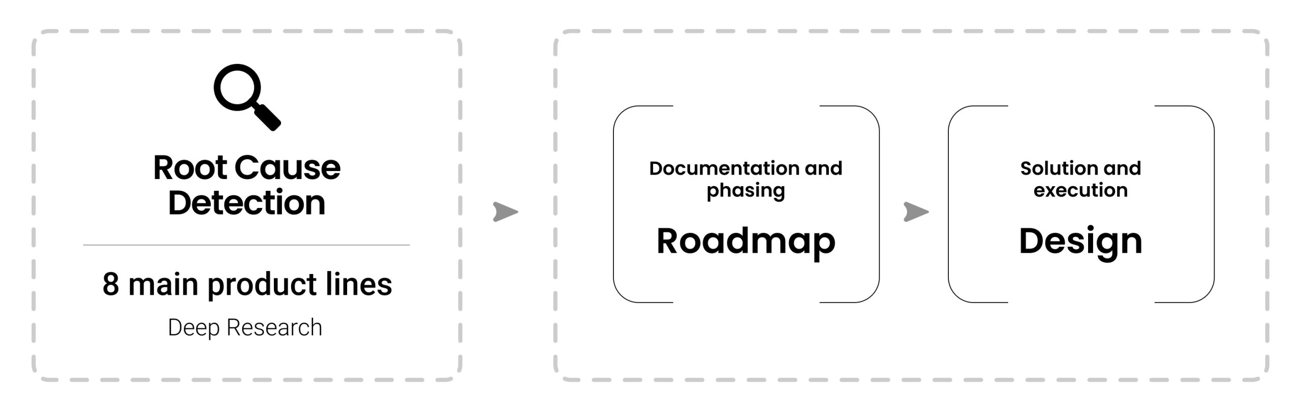
First part: Root cause detection
I deeply believe that without finding ‘whys’ we cannot design a solution. It becomes even more important when the problem has many aspects and forms. Azki’s compare page had a similar structure across all insurance types, but in different forms and with different features, such as filters and properties. So it was necessary to analyse all of them. I chose the 8 most important ones to keep the project timeline reasonable and save resources as much as possible.
For deep research in each product line, I conducted a collection of investigations and analyses using different tools as follows:

Google
Analytics
Tracking events and flows for each product line and analysing them. Including engagement-related factors, entry points, navigation paths, step completion rate, drop-off rate, event tracking (buttons and elements), retention metrics, etc. The output was a large data sheet that I analysed in cooperation with the data analysis team to achieve a high-quality data model.
Metabase
Metabase was used to track funnels based on insurance-related properties such as coverage and terms in Azki. For each product, I examined details related to filters and user behaviour to identify patterns and pain points.

Microsoft
Clarity
Clarity’s recorded videos allowed me to observe and analyse user behaviour effectively. I reviewed various videos, each representing a different stage of the purchase journey, both on desktop and mobile devices. I logged my discoveries and matched them to the actual pain points to implement them in the redesign.

Support
team's logs
Azki’s customer support and care team implemented a system to log issues and problems that users raised or reported. This system was not so efficient, and data was not categorised properly (this issue was fixed after this project by raising it), but I found valuable data from it by searching keywords and repeated cases.
After gathering and analysing all the data, I created and presented a presentation to stakeholders and managers, detailing what is going on with each product line. The pattern of the main issues across products was almost the same. This is a summary of the main pain points and problems that caused the low conversion rate:
1
Insufficient
knowledge
The complexity of the insurance industry words and terms, and the factors affecting insurance policy details
2
Filters and
Features
Inappropriate and incomprehensible user interface, especially on mobile
3
Data Entry
Flow
Too many steps and inefficiency in receiving information
4
Categories
and Types
Improper categories and types create ambiguity and confusion among users
5
Price &
Discount code
Prices are different from other services and purchasing with a purchase code becomes a habit for users.
6
Insurance's
Card
Displaying too much information and creating ambiguity and confusion for users
Second part: Roadmap and design
I succeeded in convincing the C-levels to prioritise this redesign by providing strong data and the following roadmap. This roadmap had two important features: first, it completely managed the risk of redesign by selecting the proper product line to start, and second, by dividing it into phases, it became more feasible.
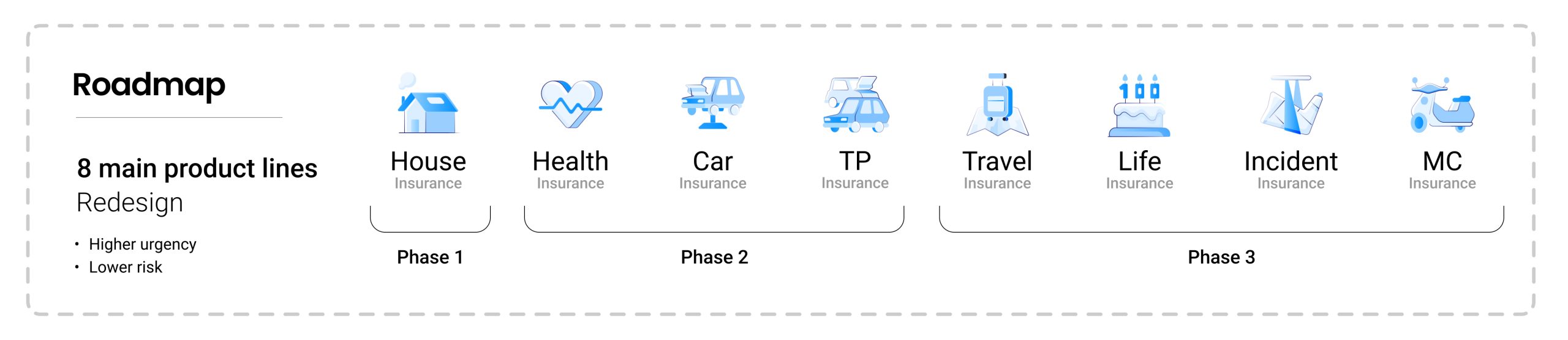
I have to say, my previous redesign of the Azki.com home page and its significant impact helped a lot in securing full support for the roadmap I had designed. The roadmap was in 3 phases; the first phase included only one product that was more urgent and carried lower business risk. After the first phase, I checked the result and made sure everything was going well, then started the second phase and after that, the third phase.
Solution
Based on the deep research results, I categorised issues into 3 main groups:
1- Improper information communication (including data entry flow, price calculation and discount code effect)
2- Usability of features and filters
3- Insurance cards
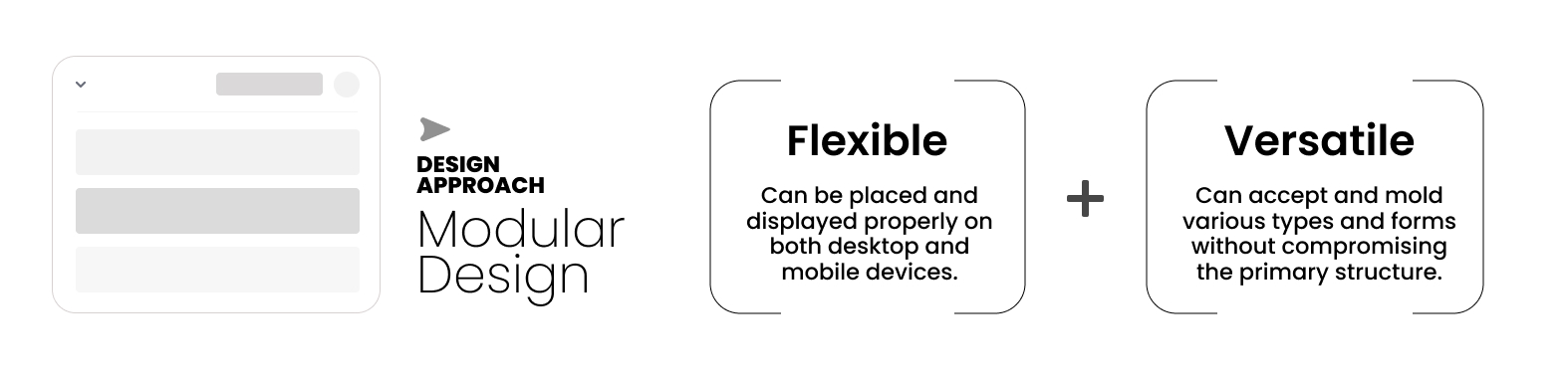
After the journey I described above, I chose Modular design approach for addressing and solving issue.
This is the structure of the compare page on mobile and desktop before redesign. I have labelled the different sections in the figure below.

Page structure
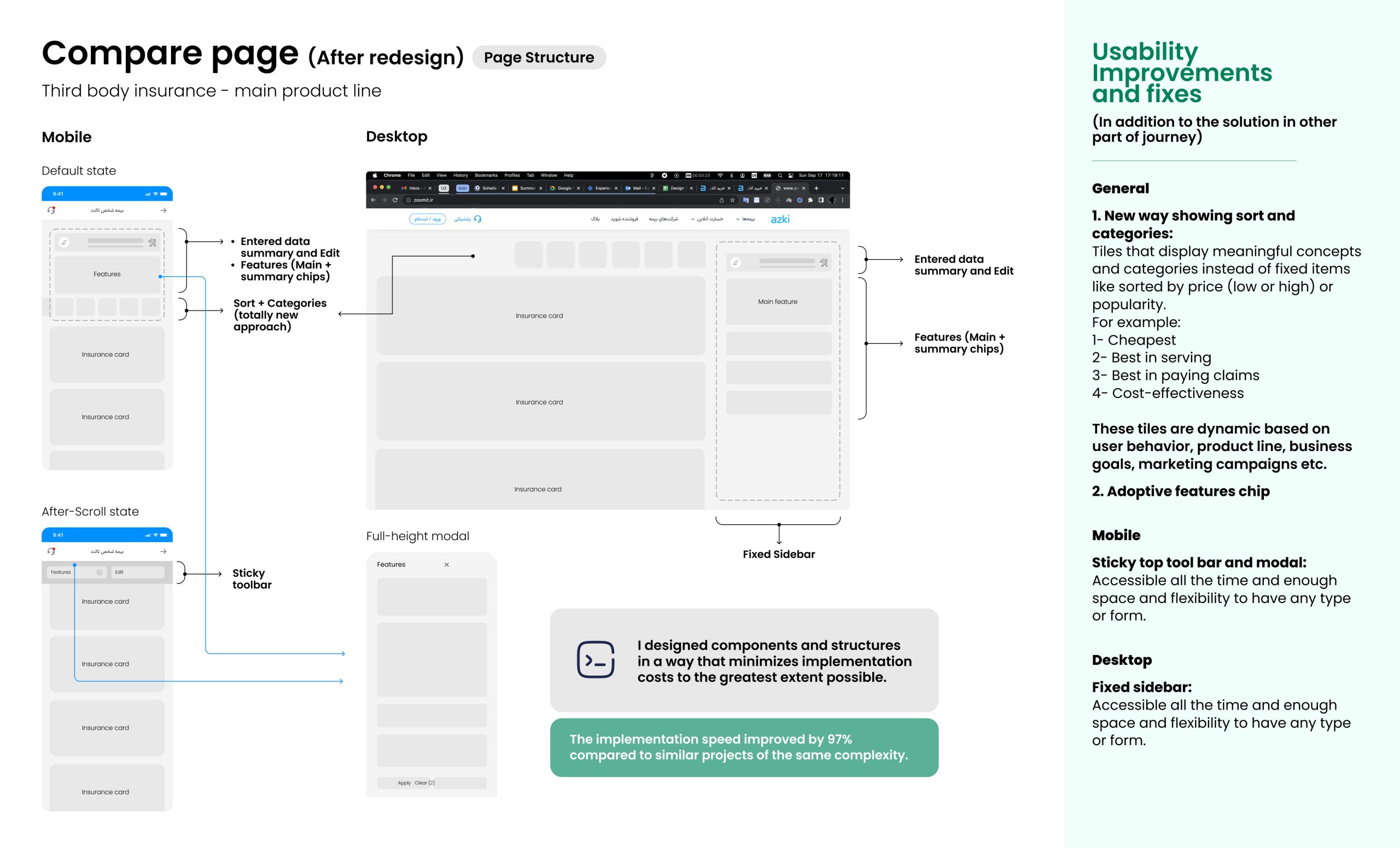
As I showed in the above figure, it was necessary to restructure the page to make it ready to accept a modular approach. Azki’s users show different device preferences across product lines; however, on average, approximately 40% of users access the platform via desktop and 60% via mobile. This was my approach in redesigning the compare page as a very flexible and scalable solution.
Module structure
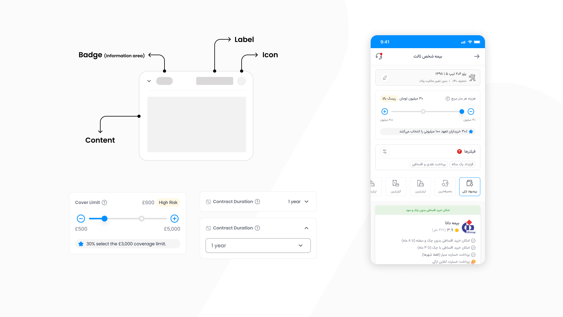
Here is the structure of the feature module. To ensure it is both flexible and versatile, I reviewed a wide range of product lines and designed the module to accommodate different types of data, forms, and functionality while maintaining a consistent structure.

Below are two examples of this module with content translated from Farsi into English for demonstration purposes.


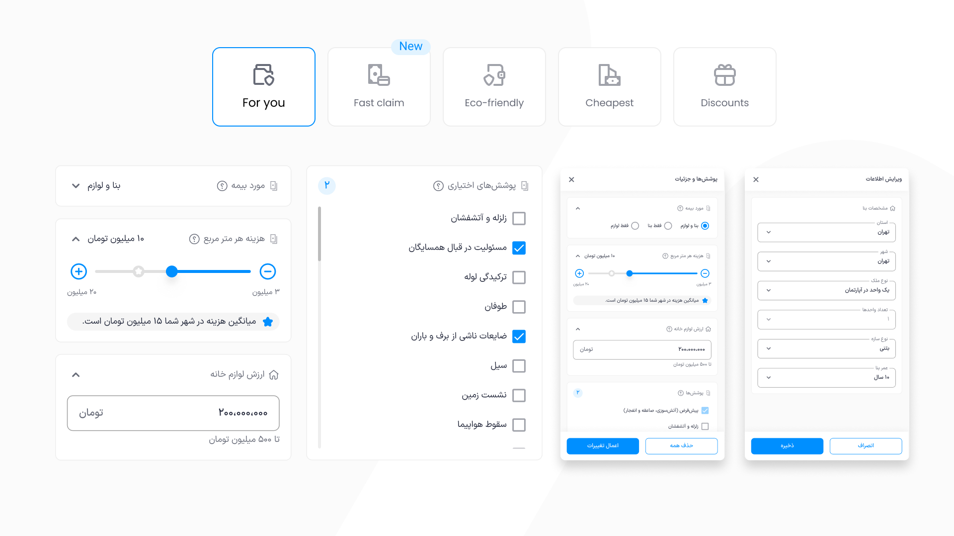
Category tiles
The main goal of implementing category tiles was to create a dynamic and personalised experience based on user behaviour and preferences. For example, certain insurance companies offer better or distinct services in specific provinces. By showing a tile that filters and sorts the results based on the user’s location, there would main goal would be more benefits for both the user and the business.
On the other hand, tiles have more potential from a visual aspect; they have icons, more meaningful labels, and they can accept badges.

Insurance cards
After lots of meetings and perusing different versions that I had designed, we decided to apply minimum changes to insurance cards becasuse of the technical limitations.
Tests and validations
Because of the importance of the project, I decided to have a usability test in 2 rounds. Each round had 5 participants; the first round was for finding issues and major bugs, and the second round was for making sure everything is working fine. I used 2 product lines for my tests: third-party and health insurance (most important and most complex). I invited users from our 2 major personas.
Results of tests were totally fine. I fixed some issues in UX writings with the help of our UX writer and some minor fixes for icons for better accessibility, specifically for category tiles, and then started the second round.
I have to say I expected good results since I researched and gathered enough data from the tools I had, like Clarity, support team's logs and Google Analytics.
Outcome & Reflection
After publishing, monitoring, and observing were one of my priorities; I created a dashboard in Metabase with the help of the data team to make this monitoring more accurate and quicker. After a month, the results were amazing, and all of the stakeholders were so impressed. In the meantime, I started designing this new structure for other product lines based on the plan that I had.
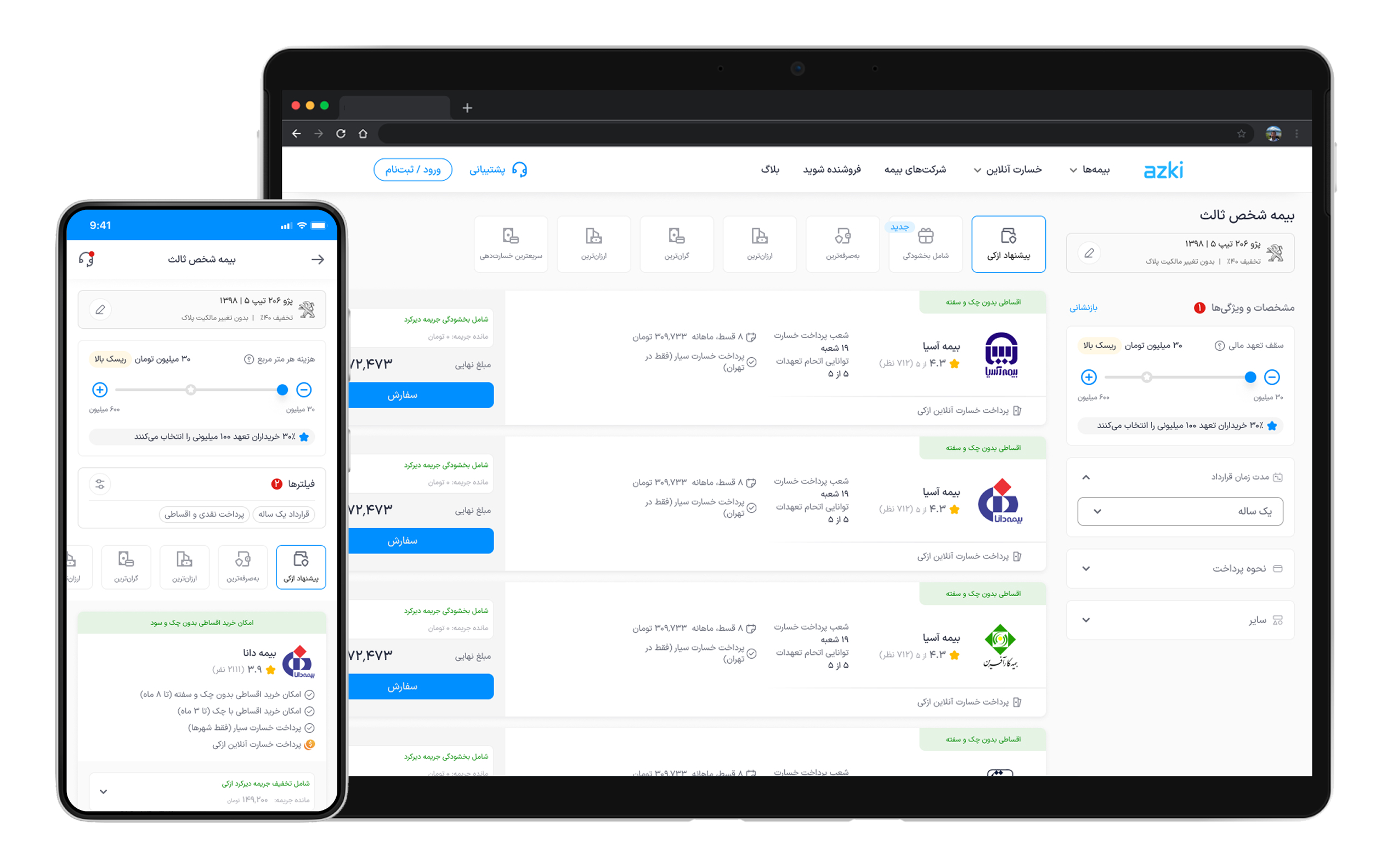
This project is one of my most important projects, since it had lots of complexity in all stages, including stakeholder management, problem framing, research, cross-functional team management, design, and test.
21.57% conversion rate improvement in average (4 product lines)
97% improvement in implementation speed
Covered 4 product lines in lest than 6 months including design and implementation